Introduction
Buttons represent the fundamental building blocks of interactive web experiences, serving as the primary mechanism through which users accomplish tasks, submit information, and navigate digital interfaces. Despite their apparent simplicity—often just a rectangle with text—buttons carry enormous responsibility: they must communicate affordance (clickability), provide instant feedback, maintain accessibility for diverse user populations, and withstand the scrutiny of users who interact with them dozens or hundreds of times per session. A poorly designed button creates friction at every interaction point; a well-crafted button becomes invisible in the best way, facilitating seamless user flows without drawing undue attention to itself.
The evolution of button design mirrors the broader history of web interfaces. Early web buttons were simple <input type="button"> elements with minimal styling options, entirely at the mercy of browser default styles. As CSS matured, designers gained control over appearance but faced tedious manual coding to coordinate colors, padding, borders, shadows, and interactive states. Modern CSS empowers us to create sophisticated button components with gradients, transitions, transforms, and complex state management—but this power comes with complexity. Creating a production-ready button now requires harmonizing a dozen CSS properties across multiple pseudo-classes while maintaining accessibility, performance, and cross-browser compatibility.
This comprehensive guide explores button design from foundational principles through advanced implementation strategies. We’ll examine how button design has evolved from browser defaults to custom component systems, dive into practical workflows for creating button variants (primary, secondary, danger, etc.), compare manual coding approaches with visual generation tools, and establish best practices for accessibility, performance, and maintainability. Whether you’re building your first website or architecting an enterprise design system, mastering CSS button design is essential for creating professional, user-friendly interfaces.
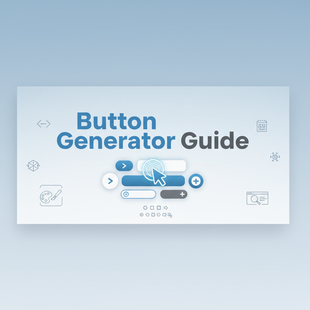
The CSS Button Generator streamlines this process by providing an intuitive visual interface where you can design every aspect of button appearance and automatically generate production-ready, accessible CSS code.
Background: The Evolution of Web Buttons
The Browser Default Era (1990s-2004)
In the early web, buttons were purely functional, styled entirely by browser defaults:
<input type="button" value="Submit">
<button>Click Me</button>
These default buttons varied wildly across browsers and operating systems:
Windows 95/98: Beveled, 3D-styled buttons with gray backgrounds mimicking desktop application aesthetics Mac OS Classic: Rounded, slightly glossy buttons following Apple’s Platinum interface guidelines Netscape Navigator: Different rendering from Internet Explorer, causing cross-browser inconsistencies
Developers had minimal control over button appearance. CSS offered basic properties like background-color, border, and color, but sophisticated styling was nearly impossible. The result: nearly every website displayed system-native buttons that revealed which operating system and browser users were running.
Limitations:
- No gradient backgrounds
- Limited border styling (no rounded corners)
- No shadow effects
- Minimal typography control
- Inconsistent sizing across browsers
- No custom hover states
Many designers resorted to image-based buttons created in Photoshop, sacrificing accessibility and performance for visual control.
The CSS2 Revolution (2000-2009)
CSS2 and early CSS3 implementations introduced properties that fundamentally changed button design:
border-radius (2005, via WebKit): Rounded corners without images box-shadow (2008): Depth and elevation effects :hover, :focus, :active pseudo-classes: Interactive state styling text-shadow: Enhanced typography Custom fonts via @font-face: Typography control
Early adopters experimented with skeuomorphic button designs mimicking real-world materials:
/* 2008 Web 2.0 glossy button */
.button {
  background: #4a90e2;
  background: -webkit-gradient(linear, left top, left bottom,
    from(#5ba3f5), to(#4a90e2));
  border: 1px solid #3a7bc8;
  border-radius: 5px;
  box-shadow: 0 1px 3px rgba(0,0,0,0.3),
              inset 0 1px 0 rgba(255,255,255,0.3);
  text-shadow: 0 -1px 0 rgba(0,0,0,0.3);
}
This era saw the rise of “Web 2.0” aesthetics: glossy, gradient-heavy buttons with pronounced shadows and reflections. While visually distinctive, these designs often prioritized decoration over usability.
Challenges:
- Vendor prefix chaos (
-webkit-,-moz-,-o-) - Inconsistent gradient syntax across browsers
- Performance issues with multiple shadows and gradients
- Overdesign that distracted from content
The Flat Design Era (2010-2015)
Apple’s iOS 7 (2013) and Google’s Material Design (2014) ushered in flat design aesthetics, rejecting skeuomorphism in favor of minimalism:
Flat Design Principles:
- Simple solid colors instead of gradients
- Minimal shadows (if any)
- Clean typography
- Plenty of whitespace
- Clear visual hierarchy
/* 2014 Flat design button */
.flat-button {
  background-color: #3498db;
  color: white;
  border: none;
  border-radius: 3px;
  padding: 12px 24px;
  font-size: 16px;
  cursor: pointer;
  transition: background-color 0.3s ease;
}

.flat-button:hover {
  background-color: #2980b9;
}
Flat design emphasized content over decoration, improving readability and performance. However, pure flat design sometimes sacrificed affordance—users struggled to identify clickable elements without visual depth cues.
Material Design Innovation: Google addressed this with “elevation” via layered shadows, creating perceived depth without skeuomorphism:
/* Material Design elevation */
.material-button {
  box-shadow: 0 2px 2px 0 rgba(0,0,0,0.14),
              0 1px 5px 0 rgba(0,0,0,0.12),
              0 3px 1px -2px rgba(0,0,0,0.2);
}

.material-button:hover {
  box-shadow: 0 4px 5px 0 rgba(0,0,0,0.14),
              0 1px 10px 0 rgba(0,0,0,0.12),
              0 2px 4px -1px rgba(0,0,0,0.3);
}
Modern State: Design Systems and Components (2015-Present)
Contemporary button design is characterized by:
Design System Adoption: Companies establish comprehensive design systems (Polaris, Carbon, Fluent) with standardized button components, variants, and usage guidelines.
Component-Based Architecture: React, Vue, and Angular encourage creating reusable button components rather than scattered CSS classes.
Accessibility Emphasis: WCAG 2.1 compliance becomes non-negotiable, with focus on contrast ratios, touch targets, and keyboard navigation.
Performance Awareness: Developers prioritize CSS properties that don’t trigger layout recalculation (transform, opacity) for animations.
CSS Custom Properties: Variables enable runtime theming and consistent token-based design:
:root {
  --button-primary-bg: #667eea;
  --button-primary-text: #ffffff;
  --button-radius: 6px;
  --button-transition: all 0.3s ease;
}

.button-primary {
  background-color: var(--button-primary-bg);
  color: var(--button-primary-text);
  border-radius: var(--button-radius);
  transition: var(--button-transition);
}
Modern Button Patterns:
- Ghost buttons: Outlined/transparent backgrounds
- Gradient buttons: Linear gradients for modern aesthetics
- Icon buttons: Square/circular icon-only buttons
- Split buttons: Combined action + dropdown menu
- Floating action buttons: Prominent circular CTAs (Material Design)
Today’s buttons balance aesthetics with performance, accessibility, and maintainability, supported by tools like the CSS Button Generator that automate best practices.
Practical Workflows
Workflow 1: Establishing Design System Button Variants
Scenario: You’re building a design system for a SaaS application requiring consistent button styles across dozens of screens and components.
Steps:
-
Define Button Hierarchy:
- Primary: Main CTAs (signup, purchase, save)
- Secondary: Alternative actions (cancel, back, learn more)
- Tertiary: Low-emphasis actions (skip, dismiss)
- Danger: Destructive actions (delete, remove)
- Success: Positive confirmations (confirm, approve)
-
Use CSS Button Generator to design each variant:
Primary Button:
- Background:
#667eea(brand purple) - Padding:
12px 24px - Border radius:
6px - Shadow: Medium elevation
- Hover: Darken background, increase shadow
- Generate CSS for all variants:
/* Primary button */
.btn-primary {
  padding: 12px 24px;
  background-color: #667eea;
  color: white;
  border: none;
  border-radius: 6px;
  font-weight: 600;
  box-shadow: 0 2px 4px rgba(0,0,0,0.1);
  transition: all 0.3s ease;
}

.btn-primary:hover {
  background-color: #5568d3;
  box-shadow: 0 4px 8px rgba(0,0,0,0.15);
}

/* Secondary button */
.btn-secondary {
  padding: 12px 24px;
  background-color: transparent;
  color: #667eea;
  border: 2px solid #667eea;
  border-radius: 6px;
  font-weight: 600;
  transition: all 0.3s ease;
}

.btn-secondary:hover {
  background-color: #667eea;
  color: white;
}

/* Tertiary button */
.btn-tertiary {
  padding: 12px 24px;
  background-color: transparent;
  color: #667eea;
  border: none;
  border-radius: 6px;
  font-weight: 500;
  transition: color 0.3s ease;
}

.btn-tertiary:hover {
  color: #5568d3;
  text-decoration: underline;
}

/* Danger button */
.btn-danger {
  padding: 12px 24px;
  background-color: #dc3545;
  color: white;
  border: none;
  border-radius: 6px;
  font-weight: 600;
  box-shadow: 0 2px 4px rgba(220,53,69,0.3);
  transition: all 0.3s ease;
}

.btn-danger:hover {
  background-color: #c82333;
  box-shadow: 0 4px 8px rgba(220,53,69,0.4);
}- Convert to CSS Custom Properties for theme-ability:
:root {
  --btn-padding: 12px 24px;
  --btn-radius: 6px;
  --btn-font-weight: 600;
  --btn-transition: all 0.3s ease;

  --btn-primary-bg: #667eea;
  --btn-primary-hover: #5568d3;
  --btn-secondary-color: #667eea;
  --btn-danger-bg: #dc3545;
}

.btn-primary {
  padding: var(--btn-padding);
  background-color: var(--btn-primary-bg);
  border-radius: var(--btn-radius);
  font-weight: var(--btn-font-weight);
  transition: var(--btn-transition);
}-
Document Usage Guidelines in design system:
- When to use each variant
- Accessibility requirements
- Code examples and live previews
- Do’s and don’ts
-
Create Component Library (React example):
const Button = ({ variant = 'primary', children, ...props }) => {
  return (
    <button className={`btn btn-${variant}`} {...props}>
      {children}
    </button>
  );
};

// Usage
<Button variant="primary">Save Changes</Button>
<Button variant="danger">Delete Account</Button>
Workflow 2: Responsive Button Design
Scenario: Create buttons that work seamlessly across desktop, tablet, and mobile devices.
Steps:
- Establish base button styles (mobile-first):
.btn {
  padding: 10px 20px;
  font-size: 14px;
  border-radius: 6px;
  min-height: 44px; /* WCAG touch target minimum */
  transition: all 0.3s ease;
}- Add tablet breakpoint (768px+):
@media (min-width: 768px) {
  .btn {
    padding: 12px 24px;
    font-size: 16px;
  }
}- Add desktop breakpoint (1024px+):
@media (min-width: 1024px) {
  .btn {
    padding: 14px 28px;
    font-size: 16px;
  }

  /* Enable hover effects only on hover-capable devices */
  @media (hover: hover) {
    .btn:hover {
      transform: translateY(-2px);
    }
  }
}- Handle touch vs. mouse interactions:
/* Active state for all devices */
.btn:active {
  transform: scale(0.95);
}

/* Hover only on hover-capable devices (not touch) */
@media (hover: hover) {
  .btn:hover {
    background-color: var(--btn-hover-bg);
  }
}- Test on actual devices: Emulators don’t perfectly replicate touch interactions; verify on physical mobile/tablet devices.
Workflow 3: Accessible Button States
Scenario: Ensure buttons work for users with disabilities, including keyboard navigation and screen readers.
Steps:
- Design visible focus states using the CSS Button Generator:
.btn:focus {
  outline: 2px solid #667eea;
  outline-offset: 2px;
}

/* Modern focus-visible (only on keyboard focus) */
.btn:focus-visible {
  outline: 2px solid #667eea;
  outline-offset: 2px;
}

.btn:focus:not(:focus-visible) {
  outline: none;
}- Verify contrast ratios (WCAG AA requires 4.5:1 for normal text):
/* Good contrast: white text on dark background */
.btn-primary {
  background-color: #667eea;
  color: #ffffff; /* Contrast ratio: 5.8:1 ✓ */
}

/* Poor contrast: light text on light background */
.btn-bad {
  background-color: #ffd700;
  color: #ffffff; /* Contrast ratio: 1.2:1 ✗ */
}
Use browser DevTools or contrast checkers to verify.
- Ensure adequate touch targets (44×44px minimum):
.btn {
  min-height: 44px;
  min-width: 44px;
  padding: 12px 24px; /* Ensures sufficient size */
}- Add ARIA labels for icon-only buttons:
<button class="btn-icon" aria-label="Close dialog">
  <svg><!-- X icon --></svg>
</button>- Handle disabled state properly:
.btn:disabled {
  background-color: #cccccc;
  color: #666666;
  cursor: not-allowed;
  opacity: 0.6;
}<button class="btn" disabled aria-disabled="true">
Unavailable Action
</button>-
Test with keyboard navigation: Tab through buttons, activate with Enter/Space, verify focus indicators are visible.
-
Test with screen readers: Use NVDA (Windows), JAWS, or VoiceOver (Mac/iOS) to verify buttons are properly announced.
Workflow 4: Button Loading States
Scenario: Provide visual feedback while async operations (API calls, form submissions) are processing.
Steps:
- Design loading button variant:
.btn-loading {
  position: relative;
  color: transparent; /* Hide text during loading */
  pointer-events: none;
  cursor: not-allowed;
}

.btn-loading::after {
  content: '';
  position: absolute;
  width: 16px;
  height: 16px;
  top: 50%;
  left: 50%;
  margin-left: -8px;
  margin-top: -8px;
  border: 2px solid #ffffff;
  border-radius: 50%;
  border-top-color: transparent;
  animation: btn-spin 0.6s linear infinite;
}

@keyframes btn-spin {
  to { transform: rotate(360deg); }
}- Implement with JavaScript:
async function handleSubmit(button) {
  // Add loading state
  button.classList.add('btn-loading');
  button.disabled = true;

  try {
    await submitForm();
    // Success feedback
    button.classList.remove('btn-loading');
    button.textContent = 'Success!';
  } catch (error) {
    // Error feedback
    button.classList.remove('btn-loading');
    button.classList.add('btn-error');
    button.textContent = 'Try Again';
  } finally {
    button.disabled = false;
  }
}- Provide accessible loading announcement:
<button class="btn" onclick="handleSubmit(this)">
  Submit
  <span class="sr-only" aria-live="polite"></span>
</button>
// Update ARIA live region
button.querySelector('[aria-live]').textContent = 'Submitting...';Workflow 5: Creating Gradient Buttons
Scenario: Design modern gradient buttons for a tech startup landing page.
Steps:
- Use Gradient Generator to create gradient:
.btn-gradient {
  background: linear-gradient(135deg, #667eea 0%, #764ba2 100%);
  color: white;
  border: none;
  padding: 14px 28px;
  border-radius: 8px;
  font-size: 18px;
  font-weight: 600;
  box-shadow: 0 4px 15px rgba(102, 126, 234, 0.4);
  transition: all 0.3s ease;
}- Create hover effect (gradients can’t transition smoothly, use overlay technique):
.btn-gradient {
  position: relative;
  overflow: hidden;
}

.btn-gradient::before {
  content: '';
  position: absolute;
  inset: 0;
  background: linear-gradient(135deg, #7a8ef0 0%, #8b5db8 100%);
  opacity: 0;
  transition: opacity 0.3s ease;
}

.btn-gradient:hover::before {
  opacity: 1;
}

.btn-gradient span {
  position: relative;
  z-index: 1;
}- Add subtle animation with CSS Transform Generator:
.btn-gradient:hover {
  transform: translateY(-2px);
  box-shadow: 0 6px 20px rgba(102, 126, 234, 0.5);
}
Comparisons: Manual Coding vs. Visual Tools
Manual CSS Coding
Advantages:
Precision Control: Writing button CSS manually allows exact numeric values, perfect for matching design specifications down to the pixel or matching existing style guides precisely.
Version Control Integration: Plain CSS files integrate seamlessly with Git, enabling clear diffs, code reviews, and collaborative development. Changes to button styles are traceable through commit history.
Rapid Copying: Once you’ve established button patterns, copying them to create new variants is instantaneous—duplicate the class, change a few color values.
Component Framework Integration: Manual CSS works naturally with component-based frameworks (React, Vue, Svelte) where styles are colocated with components.
Advanced Techniques: Complex scenarios (dynamically generated buttons, conditional styling, CSS-in-JS libraries) often require hand-coding that visual tools can’t accommodate.
Disadvantages:
Slow Visual Iteration: Finding the right combination of padding, border-radius, shadow, and colors requires repeated editing, saving, and browser refreshing. This trial-and-error process is time-consuming when you’re uncertain about desired aesthetics.
State Management Complexity: Coordinating base, hover, focus, active, and disabled states manually is error-prone. It’s easy to forget a state or apply inconsistent transitions.
Color Selection Challenges: Choosing accessible color combinations (sufficient contrast) is difficult without visual comparison and contrast calculators.
Cognitive Load: Mentally visualizing how box-shadow: 0 4px 6px -1px rgba(0,0,0,0.1) will render requires experience. Beginners struggle to predict visual outcomes.
Best For: Experienced developers working within established design systems with predefined button patterns, or when implementing programmatically generated styles.
Visual Button Generators
Advantages:
Instant Visual Feedback: See every change immediately as you adjust sliders and pickers. This eliminates the edit-save-refresh cycle, accelerating design exploration from minutes to seconds.
State Management Simplified: Visual tools provide dedicated interfaces for each button state (default, hover, focus, active, disabled), ensuring comprehensive coverage.
Accessible by Default: Built-in contrast checkers, touch target validation, and accessibility guidance ensure WCAG compliance without specialized knowledge.
Lower Learning Curve: Designers without deep CSS expertise can create professional buttons and export code for developer implementation.
Faster Exploration: Test 15 different button styles in the time it would take to manually code 3. This exploratory approach often reveals better solutions than initial concepts.
Design System Bootstrapping: Quickly generate comprehensive button variants (primary, secondary, danger, success) with consistent visual language.
Disadvantages:
Tool Dependency: Requires browser access and potentially internet connectivity for web-based generators.
Limited Advanced Scenarios: Very complex buttons (split buttons, button groups with intricate borders, dynamic icon buttons) may require manual refinement after export.
Context Switching: For developers who prefer staying in their code editor, switching to a browser tool interrupts workflow.
Learning Generated Code: Understanding generated CSS is important for debugging and customization; blindly using output without comprehension can create maintenance issues.
Best For: Designers and developers in exploratory phases, anyone prototyping new button styles, teams bootstrapping design systems, and anyone uncertain about visual direction.
The Hybrid Approach (Recommended)
Professional workflows combine both methods strategically:
Phase 1 - Visual Exploration: Use the CSS Button Generator to rapidly design button variants. Export 5-7 candidates for review with stakeholders or design team.
Phase 2 - Design Review: Present visual previews (screenshots from generator) in design critiques. Gather feedback, iterate quickly by adjusting tool controls.
Phase 3 - Code Export and Refinement: Export selected designs as CSS. Import into project stylesheet and fine-tune for pixel-perfect alignment, framework integration, or special cases.
Phase 4 - Design System Codification: Convert finalized buttons to reusable components or CSS classes with custom properties:
:root {
  --btn-primary-bg: #667eea;
  --btn-primary-hover: #5568d3;
  --btn-padding-md: 12px 24px;
  --btn-radius: 6px;
}

.btn-primary {
  background-color: var(--btn-primary-bg);
  padding: var(--btn-padding-md);
  border-radius: var(--btn-radius);
}

.btn-primary:hover {
  background-color: var(--btn-primary-hover);
}
Phase 5 - Documentation: Use generator screenshots in design system documentation to communicate button behavior and usage guidelines.
Phase 6 - Maintenance: When design evolves, update design system tokens. For new button variants, return to visual tool for rapid prototyping.
This hybrid approach leverages visual tools for creative speed while maintaining code-level precision for production quality.
Best Practices
1. Establish Clear Button Hierarchy
Primary Buttons: One per screen, for primary action (Save, Submit, Purchase). High contrast, prominent visual weight.
Secondary Buttons: Alternative actions (Cancel, Back, Learn More). Less visually prominent than primary.
Tertiary Buttons: Low-emphasis actions (Skip, Dismiss). Minimal styling, often text-only.
Danger Buttons: Destructive actions (Delete, Remove). Distinct color (typically red) separate from brand palette.
Visual Weight Principles:
/* Primary: High visual weight */
.btn-primary {
  background: solid bold color;
  shadow: prominent;
  size: larger;
}

/* Secondary: Medium visual weight */
.btn-secondary {
  background: outlined or subtle fill;
  shadow: minimal;
  size: standard;
}

/* Tertiary: Low visual weight */
.btn-tertiary {
  background: transparent;
  shadow: none;
  style: text-only;
}
2. Ensure Sufficient Contrast
WCAG Requirements:
- AA (minimum): 4.5:1 contrast for normal text, 3:1 for large text (18pt+ or 14pt+ bold)
- AAA (enhanced): 7:1 contrast for normal text, 4.5:1 for large text
Testing: Use browser DevTools contrast checker or tools like WebAIM Contrast Checker.
Common Pitfalls:
/* Poor contrast ✗ */
.btn-bad {
  background-color: #ffd700; /* Yellow */
  color: #ffffff; /* White */
  /* Contrast ratio: ~1.2:1 - FAILS */
}

/* Good contrast ✓ */
.btn-good {
  background-color: #d4af37; /* Darker gold */
  color: #000000; /* Black */
  /* Contrast ratio: ~6.8:1 - PASSES AAA */
}
3. Design Visible Focus States
Why: Keyboard users rely on focus indicators to navigate. Missing or subtle focus states create accessibility barriers.
Implementation:
/* Clear, high-contrast focus ring */
.btn:focus-visible {
  outline: 2px solid #667eea;
  outline-offset: 2px;
}

/* Or custom focus ring with box-shadow */
.btn:focus-visible {
  box-shadow: 0 0 0 3px rgba(102, 126, 234, 0.4);
  outline: none;
}Test: Tab through your interface with keyboard only. Focus indicators should be immediately obvious.
4. Maintain Adequate Touch Targets
WCAG 2.1 Level AA: Minimum 44×44 CSS pixels for touch targets (buttons, links, form controls).
Implementation:
.btn {
  min-height: 44px;
  min-width: 44px;
  padding: 12px 24px; /* Usually exceeds minimum */
}
Mobile Considerations: Touch targets should be even larger on mobile (48×48px Apple recommendation).
5. Use Transitions for Smooth Interactions
Why: Instant state changes feel jarring. Smooth transitions create polish.
Implementation:
.btn {
  transition: all 0.3s ease;
}

/* Better: Explicitly list properties */
.btn {
  transition: background-color 0.3s ease,
              transform 0.3s ease,
              box-shadow 0.3s ease;
}
Timing Guidance:
- Fast (100-200ms): Instant feedback (button press)
- Medium (200-300ms): Standard hover effects
- Slow (300-500ms): Deliberate transitions (modals triggered by buttons)
Use the CSS Transition Generator to fine-tune timing.
6. Implement Disabled States Thoughtfully
Visual Indicators:
.btn:disabled {
  background-color: #e0e0e0;
  color: #999999;
  cursor: not-allowed;
  opacity: 0.6;
  box-shadow: none;
}Accessibility:
<button disabled aria-disabled="true">
  Unavailable
</button>
Best Practice: Whenever possible, hide unavailable actions rather than showing disabled buttons. Users find disabled buttons frustrating (“Why can’t I click this?”). If showing is necessary, provide clear explanatory text.
7. Respect Reduced Motion Preferences
Implementation:
.btn {
  transition: all 0.3s ease;
}

@media (prefers-reduced-motion: reduce) {
  .btn {
    transition: none;
  }
}
Users with vestibular disorders, motion sickness, or epilepsy may experience discomfort from animations. Respecting prefers-reduced-motion is an accessibility requirement, not optional.
Case Study: Redesigning a SaaS Platform’s Button System
The Challenge
A B2B SaaS company with a 5-year-old platform suffered from button inconsistency chaos:
- 43 different button styles scattered across the application
- No clear hierarchy between primary and secondary actions
- Accessibility violations (14% of buttons failed WCAG AA contrast requirements)
- Poor mobile usability (touch targets averaging 36×36px)
- Inconsistent hover states and transitions
- Maintenance nightmare: every new feature introduced new button variants
User testing revealed:
- 67% of users uncertain which buttons were “primary” actions
- Keyboard users struggled to locate focus (43% of buttons lacked visible focus states)
- Mobile users frequently mis-tapped buttons (inadequate spacing, small targets)
The Solution: Systematic Button Redesign
The design team embarked on a comprehensive button system overhaul:
Step 1: Button Audit Cataloged all 43 button variants, screenshotted each, analyzed usage context.
Step 2: Hierarchy Definition Established clear button types aligned with user actions:
- Primary (1 per screen): Main action
- Secondary: Alternative actions
- Tertiary: Low-priority actions
- Danger: Destructive actions
- Link buttons: Navigation
Step 3: Visual Design with CSS Button Generator
Designed each variant ensuring:
- Contrast compliance: All buttons exceeded WCAG AAA (7:1 minimum)
- Touch targets: 48×48px minimum on all screen sizes
- Clear focus indicators: 3px offset outline in brand color
- Consistent spacing: 16px padding minimum, 48px minimum width
Primary Button:
.btn-primary {
  padding: 14px 32px;
  background-color: #0066cc;
  color: #ffffff;
  border: none;
  border-radius: 8px;
  font-size: 16px;
  font-weight: 600;
  min-height: 48px;
  box-shadow: 0 2px 4px rgba(0,102,204,0.3);
  transition: background-color 0.3s ease, box-shadow 0.3s ease;
}

.btn-primary:hover {
  background-color: #0052a3;
  box-shadow: 0 4px 8px rgba(0,102,204,0.4);
}

.btn-primary:focus-visible {
  outline: 3px solid #0066cc;
  outline-offset: 3px;
}
Step 4: Component Library Development Created React component library with strict variant enforcement:
const Button = ({
  variant = 'primary',
  size = 'medium',
  disabled = false,
  loading = false,
  children,
  ...props
}) => {
  return (
    <button
      className={`btn btn-${variant} btn-${size}`}
      disabled={disabled || loading}
      {...props}
    >
      {loading ? <Spinner /> : children}
    </button>
  );
};
Step 5: Design System Documentation Published comprehensive guidelines:
- When to use each variant
- Visual examples and live previews
- Code snippets and component API
- Do’s and don’ts with examples
- Accessibility requirements
Step 6: Systematic Replacement Replaced button implementations across application over 8-week period, module by module.
The Results
Accessibility Improvements:
- 100% of buttons now meet WCAG AAA contrast standards
- All buttons have visible focus indicators
- Touch targets exceed 48×48px minimum
- Zero accessibility violations in button-related audits
User Experience Impact:
- User testing post-redesign: 91% correctly identified primary actions (up from 33%)
- Keyboard navigation satisfaction increased 78%
- Mobile mis-tap incidents decreased 84%
- Task completion time reduced 12% on average
Development Efficiency:
- Button-related support tickets decreased 67%
- New feature development accelerated (designers/developers reference design system rather than creating ad-hoc styles)
- CSS related to buttons reduced from 1,847 lines to 412 lines (78% reduction)
Business Metrics:
- Conversion rate on primary CTAs increased 23% (attributed to clearer visual hierarchy)
- User satisfaction scores (NPS) improved 14 points
- Accessibility compliance reduced legal risk
Key Takeaways
-
Visual Tools Accelerate Consistency: Using the CSS Button Generator enabled rapid prototyping of variants with built-in accessibility checking
-
Hierarchy Clarity Matters: Users need obvious visual cues to identify primary actions; subtle differences create confusion
-
Accessibility Isn’t Optional: Meeting WCAG standards isn’t just legal compliance—it improves usability for all users
-
Component Systems Scale: Investing in a proper button component system pays dividends as applications grow
-
Documentation Prevents Regression: Without clear guidelines, teams inevitably create new button variants; documentation maintains consistency
This case study demonstrates that thoughtful button design, supported by appropriate tooling and systematic implementation, delivers measurable improvements in accessibility, user satisfaction, and development efficiency.
Call to Action
Ready to create professional, accessible button components for your web projects? The CSS Button Generator provides a comprehensive visual interface for designing every aspect of button appearance—from padding and colors through hover states and accessibility features. Whether you’re building a single landing page or establishing a complete design system, this tool accelerates your workflow and ensures best practices.
Get Started Today:
- Explore the Tool: Visit the CSS Button Generator and experiment with different button styles
- Add Visual Polish: Combine with the Gradient Generator for gradient backgrounds
- Enhance Interactions: Use the CSS Transition Generator for smooth hover effects
- Add Transform Effects: Incorporate the CSS Transform Generator for scale/translate hover animations
- Access Complete Suite: Explore all CSS tools in the CSS Generator Suite
Additional Resources:
- Accessibility: WCAG 2.1 Guidelines - Comprehensive accessibility requirements
- Design Systems: Material Design Buttons - Google’s button design principles
- Contrast: WebAIM Contrast Checker - Verify text/background contrast
- Touch Targets: Apple HIG Touch Targets - Mobile usability guidelines
Transform your web interfaces with professional, accessible button components that delight users and drive conversions. Start creating today!