Executive Summary
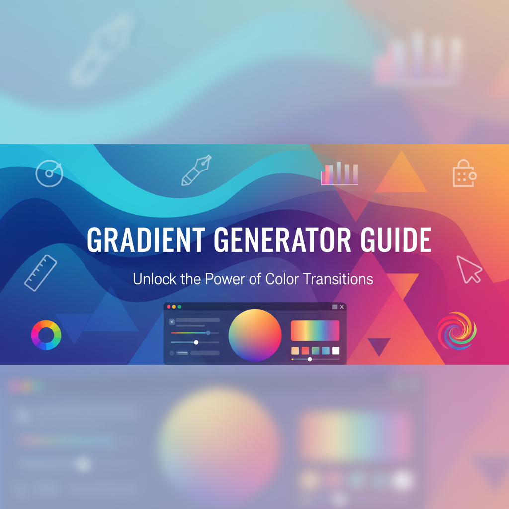
The Gradient Generator is a streamlined, intuitive tool designed to help developers and designers create beautiful CSS gradients without writing code manually. Whether you need a subtle linear gradient for a modern UI, a radiant radial effect for hero sections, or an experimental conic gradient for data visualizations, this tool provides an accessible interface with real-time preview capabilities.
Unlike complex design software that requires steep learning curves, the Gradient Generator focuses on simplicity and efficiency. You can quickly select gradient types (linear, radial, or conic), add or remove color stops by clicking on a visual slider, adjust angles or positions with intuitive controls, and instantly copy the generated CSS code. The tool is perfect for rapid prototyping, learning CSS gradient syntax, and maintaining consistency across design systems.
Key Benefits:
- Instant Visual Feedback: See your gradient update in real-time as you adjust colors, positions, and angles
- Multiple Gradient Types: Support for linear, radial, and conic gradients covering all modern CSS gradient functions
- Clean Code Output: Generates optimized, cross-browser compatible CSS ready for production
- Zero Configuration: No installation, no dependencies—just open and start creating
- Educational Resource: Learn gradient syntax by experimenting with different configurations
This tool complements advanced solutions like Gradienta Pro: AI & CSS Gradient Editor and the Ultimate CSS Gradient Generator & Editor, providing a simplified workflow for quick gradient creation tasks.
Feature Tour
1. Gradient Type Selection
Choose between three CSS gradient types:
- Linear Gradient: Creates smooth transitions along a straight line (top to bottom, left to right, or at custom angles)
- Radial Gradient: Radiates colors outward from a central point in a circular or elliptical pattern
- Conic Gradient: Sweeps colors around a center point like a color wheel
Each type provides unique visual effects suitable for different design scenarios. The interface clearly highlights the selected type with visual indicators.
2. Interactive Color Stop Editor
The heart of the tool is the visual color stop slider. Click anywhere on the gradient preview bar to add a new color stop, or click existing stops to edit them. Each color stop includes:
- Color Picker: Full RGB/HSL color selection with opacity control
- Position Slider: Precise percentage-based positioning from 0% to 100%
- Delete Button: Remove unwanted color stops with a single click
The minimum requirement is two color stops, but you can add as many as needed to create complex, multi-color gradients. Color stops automatically sort themselves by position to maintain gradient integrity.
3. Angle and Position Controls
For linear gradients, adjust the angle from 0° to 360°:
- 0° = bottom to top
- 90° = left to right
- 180° = top to bottom (default)
- 270° = right to left
For radial and conic gradients, control the center position using X and Y percentage values, allowing you to shift the gradient’s focal point anywhere within the container.
4. Live Preview Canvas
A large, responsive preview area shows your gradient exactly as it will appear in CSS. The preview updates instantly as you modify any parameter, providing immediate visual feedback. The canvas includes:
- Responsive sizing that adapts to different screen sizes
- Full-screen mode option for detailed inspection
- Overlay grid for alignment reference (optional)
5. CSS Code Generator
The tool generates optimized CSS code with:
- Modern
linear-gradient(),radial-gradient(), orconic-gradient()syntax - Proper color space handling and alpha transparency
- Vendor prefixes for older browser support (optional toggle)
- One-click copy to clipboard functionality
Example output:
background: linear-gradient(180deg, #667eea 0%, #764ba2 100%);6. Preset Library Integration
Access a curated collection of professionally designed gradient presets for instant inspiration. Each preset can be loaded with one click and further customized to match your needs. Presets cover various categories:
- Professional business gradients
- Vibrant creative palettes
- Subtle UI backgrounds
- Seasonal and thematic collections
7. Accessibility Features
The Gradient Generator includes built-in accessibility considerations:
- Keyboard Navigation: Tab through controls, use arrow keys for numeric adjustments
- Focus Indicators: Clear visual focus states for all interactive elements
- Screen Reader Support: ARIA labels and announcements for all controls
- Color Contrast Warnings: Alerts when text overlays may have insufficient contrast
For comprehensive accessibility guidance, explore the CSS Generator Suite documentation.
Usage Scenarios
Scenario 1: Website Header Background
Create an engaging header background that draws visitor attention without overwhelming content.
Workflow:
- Select Linear Gradient type
- Set angle to 135° for a diagonal sweep
- Add first color stop:
#667eeaat 0% - Add second color stop:
#764ba2at 100% - Optionally add a third stop at 50% with
#f093fbfor a three-color transition - Copy the generated CSS to your stylesheet
Result: A professional, modern gradient that works beautifully with white text overlays.
Scenario 2: Button Hover Effects
Design subtle gradient transitions for interactive button states.
Workflow:
- Create base gradient: Linear, 180°, from
#4facfeto#00f2fe - Export CSS for default state
- Adjust colors slightly lighter (add 10% lightness)
- Export CSS for
:hoverstate - Combine with CSS transitions for smooth hover effect
Pair with the Button Generator for complete button styling solutions.
Scenario 3: Loading Spinner Background
Create dynamic, animated gradient backgrounds using conic gradients.
Workflow:
- Select Conic Gradient type
- Position center at 50%, 50%
- Add color stops creating a spectrum effect
- Copy CSS and combine with
animationkeyframes - Rotate the element for a spinning effect
CSS Integration:
.spinner {
  background: conic-gradient(from 0deg, #f00 0deg, #ff0 60deg, #0f0 120deg, #0ff 180deg, #00f 240deg, #f0f 300deg, #f00 360deg);
  animation: spin 2s linear infinite;
}

@keyframes spin {
  to { transform: rotate(360deg); }
}
Scenario 4: Card Overlays and Glassmorphism
Design semi-transparent gradient overlays for modern glassmorphic UI components.
Workflow:
- Choose Linear Gradient, 180° angle
- Set first color:
rgba(255, 255, 255, 0.25)at 0% - Set second color:
rgba(255, 255, 255, 0.05)at 100% - Layer over backdrop-filter blur for glass effect
- Use with border-radius from Border Radius Generator
Scenario 5: Data Visualization Backgrounds
Create radial gradients for charts, graphs, and infographic backgrounds.
Workflow:
- Select Radial Gradient
- Position center where emphasis is needed
- Use brand colors with strategic opacity values
- Add multiple stops to create depth
- Export and integrate with chart libraries
Code Examples
Example 1: Two-Color Linear Gradient
/* Simple top-to-bottom gradient */
.hero-section {
  background: linear-gradient(180deg, #667eea 0%, #764ba2 100%);
  min-height: 100vh;
  display: flex;
  align-items: center;
  justify-content: center;
}
Example 2: Multi-Stop Sunset Gradient
/* Four-color gradient simulating sunset */
.sunset-background {
  background: linear-gradient(
    to bottom,
    #ff512f 0%,
    #dd2476 35%,
    #f093fb 65%,
    #4facfe 100%
  );
  padding: 4rem 2rem;
  color: white;
}
Example 3: Radial Gradient Spotlight
/* Center-focused radial gradient */
.spotlight-card {
  background: radial-gradient(
    circle at 50% 50%,
    rgba(103, 126, 234, 0.8) 0%,
    rgba(118, 75, 162, 0.4) 50%,
    transparent 100%
  );
  border-radius: 16px;
  padding: 2rem;
}
Example 4: Conic Gradient Color Wheel
/* Color wheel effect for design tools */
.color-wheel {
  background: conic-gradient(
    from 0deg at 50% 50%,
    red 0deg,
    yellow 60deg,
    lime 120deg,
    cyan 180deg,
    blue 240deg,
    magenta 300deg,
    red 360deg
  );
  width: 200px;
  height: 200px;
  border-radius: 50%;
}
Example 5: Animated Gradient Background
/* Gradient with CSS animation */
.animated-bg {
  background: linear-gradient(
    -45deg,
    #ee7752,
    #e73c7e,
    #23a6d5,
    #23d5ab
  );
  background-size: 400% 400%;
  animation: gradientShift 15s ease infinite;
}

@keyframes gradientShift {
  0% { background-position: 0% 50%; }
  50% { background-position: 100% 50%; }
  100% { background-position: 0% 50%; }
}
Example 6: Gradient Text Effect
/* Gradient applied to text using background-clip */
.gradient-text {
  background: linear-gradient(135deg, #667eea 0%, #764ba2 100%);
  -webkit-background-clip: text;
  -webkit-text-fill-color: transparent;
  background-clip: text;
  font-size: 3rem;
  font-weight: bold;
}
Troubleshooting
Issue 1: Gradient Not Displaying
Symptoms: Background appears solid or transparent instead of showing gradient.
Solutions:
- Ensure the element has defined dimensions (width/height)
- Check that gradient syntax is correct (no missing commas or parentheses)
- Verify color format (hex, rgb, rgba, hsl are supported)
- Confirm the element isn’t being overridden by other CSS rules
- Check browser developer tools for CSS errors
Issue 2: Colors Look Different in Browser
Symptoms: Exported gradient appears with different colors than preview.
Solutions:
- Check color space consistency (RGB vs HSL)
- Verify monitor calibration settings
- Test across multiple browsers (Chrome, Firefox, Safari)
- Consider color profile differences between displays
- Use hex values for maximum consistency
Issue 3: Gradient Appears Banded
Symptoms: Visible bands or steps instead of smooth transitions.
Solutions:
- Add intermediate color stops to smooth transitions
- Increase color bit depth in design software
- Use linear color interpolation
- Avoid gradients with extreme color differences
- Test with different color combinations
Issue 4: Performance Issues with Animated Gradients
Symptoms: Laggy animations or high CPU usage.
Solutions:
- Use
transforminstead of animatingbackground-positionwhen possible - Reduce
background-sizemultiplier (e.g., 200% instead of 400%) - Implement will-change CSS property:
will-change: background-position; - Optimize animation duration (longer is often smoother)
- Consider using pseudo-elements with opacity transitions instead
Issue 5: Gradient Not Showing in Older Browsers
Symptoms: Gradient works in modern browsers but not in older versions.
Solutions:
- Include vendor prefixes:
-webkit-,-moz-,-o- - Provide solid color fallback before gradient declaration
- Use CSS feature detection with
@supports - Consider polyfills for legacy browser support
- Test with appropriate browserslist configuration
Fallback Example:
.element {
  background: #667eea; /* Fallback for very old browsers */
  background: -webkit-linear-gradient(180deg, #667eea 0%, #764ba2 100%);
  background: linear-gradient(180deg, #667eea 0%, #764ba2 100%);
}
Issue 6: Gradient Doesn’t Respond to Container Size
Symptoms: Gradient appears stretched or cut off.
Solutions:
- Use percentage values instead of fixed pixels
- Set appropriate
background-sizeproperty - Check container’s
displayandpositionproperties - Ensure parent container has defined dimensions
- Use
background-attachment: fixed;for viewport-relative gradients
Frequently Asked Questions
Q1: What’s the difference between linear, radial, and conic gradients?
A: Each gradient type creates a different visual pattern:
- Linear gradients transition colors along a straight line (angle-based)
- Radial gradients radiate from a center point outward in circular or elliptical shapes
- Conic gradients sweep around a center point like clock hands, creating rotational color transitions
Choose based on your design intent: linear for directional flow, radial for focal emphasis, and conic for circular or pie-chart effects.
Q2: Can I use more than two colors in a gradient?
A: Absolutely! CSS gradients support unlimited color stops. Add as many colors as needed by clicking on the gradient preview bar. Each color stop can be independently positioned from 0% to 100%. Multi-color gradients are perfect for creating sunset effects, rainbow backgrounds, or complex brand palettes.
Q3: How do I make a gradient with transparency?
A: Use rgba() or hsla() color formats with an alpha channel value between 0 (transparent) and 1 (opaque). Example: rgba(103, 126, 234, 0.5) creates a semi-transparent purple. This is ideal for overlay effects, glassmorphism, and layering gradients over images or patterns.
Q4: Why does my gradient look different on mobile devices?
A: Several factors can cause this:
- Color profile differences: Mobile displays may use different color spaces
- Screen size and DPI: Higher pixel density can affect gradient rendering
- Browser variations: Mobile browsers may render gradients slightly differently
- Viewport units: If using vw/vh, calculations differ based on device screen
Test on actual devices and use consistent color formats (prefer hex or RGB) for better cross-device consistency.
Q5: Can I animate CSS gradients?
A: Yes, but with limitations. You cannot directly animate the background property smoothly, but you can:
- Animate
background-positionon a largerbackground-size - Use pseudo-elements with opacity transitions
- Transition between different gradient states on hover/focus
- Animate the element’s transform or opacity
- Use CSS custom properties (variables) for animatable color values
See the animated gradient example in the Code Examples section for implementation details.
Q6: How do I export gradients for use in design tools like Figma or Sketch?
A: The Gradient Generator creates CSS code optimized for web use. For design tools:
- Copy color values and positions manually into design software gradient tools
- Use screenshot/export features if available
- Consider using design tool plugins that import CSS gradients
- Recreate gradient using the same color stops and angles in your design software
For more advanced export options, explore the Ultimate CSS Gradient Generator & Editor which offers PNG export functionality.
Q7: What’s the browser support for CSS gradients?
A: Modern CSS gradients (linear-gradient, radial-gradient, conic-gradient) are widely supported:
- Linear and Radial: Supported in all modern browsers and IE 10+
- Conic: Supported in Chrome 69+, Firefox 83+, Safari 12.1+, Edge 79+
For maximum compatibility, include vendor prefixes and provide solid color fallbacks for very old browsers.
Q8: How many color stops should I use?
A: There’s no hard limit, but best practices suggest:
- 2-3 stops: For simple, clean gradients
- 4-5 stops: For complex transitions like sunsets or brand palettes
- 6+ stops: For special effects, rainbows, or data visualizations
Remember: more stops increase CSS file size slightly and can create complexity. Use only as many as needed for your desired effect.
References
Official Documentation
- MDN Web Docs: linear-gradient() - Comprehensive guide to CSS linear gradients with syntax and examples
- MDN Web Docs: radial-gradient() - Complete reference for radial gradient functions
- MDN Web Docs: conic-gradient() - Documentation for conic gradient syntax and use cases
- W3C CSS Images Module Level 3 - Official specification for CSS gradient functions
- Can I Use: CSS Gradients - Browser compatibility tables for all gradient types
Related Gray-wolf Tools
- Gradienta Pro: AI & CSS Gradient Editor - Advanced gradient editor with AI generation capabilities
- Ultimate CSS Gradient Generator & Editor - Comprehensive gradient tool with preset gallery and PNG export
- CSS Generator Suite - All-in-one CSS tool collection including gradient generation
- Border Radius Generator - Perfect companion for creating rounded containers with gradient backgrounds
- Button Generator - Create complete button styles including gradient backgrounds
Learning Resources
- CSS-Tricks: A Complete Guide to CSS Gradients - In-depth tutorial covering all gradient types with practical examples
- Smashing Magazine: Advanced CSS Gradient Patterns - Creative techniques for building complex patterns with gradients
Community and Inspiration
- UI Gradients - Curated collection of beautiful gradient color combinations
- Gradient Hunt - Community-driven gradient gallery with thousands of examples