Executive Summary
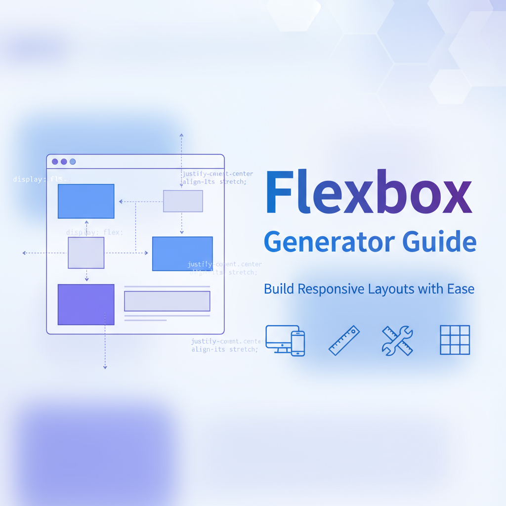
The Flexbox Generator is a comprehensive visual tool that demystifies CSS Flexbox layout by providing an interactive interface where you can experiment with flexbox properties and see results in real-time. Whether you’re a beginner learning flexbox fundamentals or an experienced developer prototyping complex layouts, this generator eliminates the trial-and-error process traditionally associated with flexbox implementation. By visualizing how properties like justify-content, align-items, and flex-direction interact, you gain intuitive understanding that accelerates development and reduces debugging time.
This tool addresses one of the most common pain points in modern web development: creating flexible, responsive layouts that adapt gracefully across devices. Flexbox offers powerful capabilities, but its numerous properties and their interactions can be overwhelming. The Flexbox Generator bridges this gap by translating abstract CSS concepts into visual representations you can manipulate directly. Configure flex containers and items through intuitive controls, preview layouts across different viewport sizes, and generate clean, production-ready CSS code instantly.
Integrated within the Gray-wolf Tools ecosystem, the Flexbox Generator works seamlessly with other layout and styling utilities to provide a complete workflow for modern CSS development. It’s particularly valuable for teams adopting flexbox-first design systems, as it helps establish consistent layout patterns and educates developers on best practices.
Feature Tour
Visual Flexbox Editor
The core of the Flexbox Generator is its interactive visual editor that displays a live flexbox container with customizable child elements. As you adjust properties using intuitive controls, the layout updates in real-time, providing immediate feedback on how each property affects element positioning. This visual approach transforms abstract CSS properties into concrete, understandable relationships between parent containers and child elements.
The editor supports drag-and-drop item reordering, dynamic addition and removal of flex items, customizable item dimensions and content, and color-coded visual indicators for spacing and alignment. This hands-on interaction creates “aha moments” that cement understanding far more effectively than reading documentation alone.
Comprehensive Property Controls
Access every flexbox property through organized control panels that group related properties logically. Container properties include flex-direction (row, column, row-reverse, column-reverse), justify-content (flex-start, center, space-between, space-around, space-evenly), align-items (stretch, flex-start, center, flex-end, baseline), flex-wrap (nowrap, wrap, wrap-reverse), and align-content for multi-line layouts. Item properties cover flex-grow, flex-shrink, and flex-basis, along with individual item alignment overrides.
Each property includes helpful tooltips explaining its purpose and common use cases. The interface prevents invalid property combinations and suggests optimal settings for common layout patterns. This guided approach helps you learn flexbox principles while building real layouts.
Responsive Preview Panel
Test your flexbox layouts across multiple device sizes without leaving the tool. The responsive preview panel shows your layout at mobile (320px), tablet (768px), desktop (1024px), and wide desktop (1440px) breakpoints. This immediate feedback helps you catch responsive issues early and understand how flexbox properties behave at different viewport widths.
Toggle between portrait and landscape orientations, preview how flex-wrap behaves with constrained widths, test alignment and distribution across screen sizes, and identify breakpoints where layout adjustments are needed. The preview panel ensures your flexbox designs work beautifully everywhere.
Code Generation and Export
Generate production-ready CSS code with a single click. The code generator outputs clean, well-commented CSS that follows best practices and includes only the properties you’ve customized. Choose between standard CSS syntax or modern CSS custom property patterns, select vendor prefixes if targeting older browsers, export with or without comments for documentation, and copy directly to clipboard or download as a file.
The generated code includes both container and item styles, properly organized and ready to integrate into your project. Inline comments explain key decisions, making the code self-documenting and educational for team members learning flexbox.
Layout Pattern Library
Jumpstart your development with pre-configured flexbox patterns for common layout needs. The pattern library includes centered content containers (horizontal and vertical centering), navigation bars with flexible spacing, card grids that wrap responsively, sticky footer layouts, holy grail three-column designs, equal-height columns without fixed heights, and split-screen layouts with flexible proportions.
Each pattern is fully customizable—use them as starting points and adjust properties to match your design requirements. The pattern library significantly reduces development time for standard layouts while teaching flexible best practices.
Flexbox Education Mode
Activate education mode to learn flexbox concepts while you build. This mode provides contextual explanations of each property as you interact with it, visual diagrams showing how properties affect layout, suggestions for alternative approaches to achieve similar results, warnings about common pitfalls and browser quirks, and links to comprehensive documentation and tutorials.
Education mode transforms the generator from a simple tool into a comprehensive learning platform. It’s ideal for teams onboarding new developers or designers transitioning from older layout techniques to modern flexbox patterns.
Usage Scenarios
Building Responsive Navigation
Create navigation bars that adapt seamlessly from mobile hamburger menus to desktop horizontal layouts. Use flexbox to control spacing between navigation items, align logo and menu items with perfect vertical centering, implement responsive wrapping when items don’t fit, and create dropdown menus with proper alignment. The Flexbox Generator helps you visualize and test navigation patterns before implementation.
Configure flex-direction to switch from row (desktop) to column (mobile), use justify-content: space-between for edge-to-edge spacing, apply align-items: center for vertical alignment, and use flex-wrap to handle overflow gracefully. Generate the code and integrate it with your media queries for fully responsive navigation.
Card Grid Layouts
Design flexible card grids that distribute items evenly across available space and wrap to new lines responsively. Flexbox excels at creating card layouts where items maintain consistent sizing while adapting to container width. Set flex-wrap: wrap to allow multi-line layouts, use flex-basis to control card widths, apply flex-grow for flexible sizing, and utilize gap properties for consistent spacing.
The responsive preview shows exactly how your cards will reflow at different breakpoints, helping you determine optimal flex-basis values and gap spacing. This approach creates robust card grids without the complexity of CSS Grid for simpler layouts.
Form Layout Alignment
Create forms with perfect label-input alignment and responsive stacking. Flexbox simplifies form layout by handling alignment automatically and adapting to content length. Configure labels and inputs as flex items within flex containers, use align-items to vertically center labels with inputs, apply flex-direction: column on mobile for stacked layouts, and leverage space-between for distributing form sections evenly.
The generator helps you prototype form layouts quickly, testing different alignments and spacing patterns until you achieve optimal usability. Generated code integrates seamlessly with form validation and accessibility features.
Dashboard Widget Placement
Build dashboard layouts where widgets fill available space proportionally. Flexbox’s flex-grow and flex-shrink properties enable sophisticated space distribution that responds to container size changes. Create sidebar-content layouts with flexible width distribution, multi-panel interfaces that resize proportionally, and widget grids where items expand to fill empty space while maintaining minimum sizes.
Use the generator to experiment with different flex-grow ratios, test how layouts respond when widgets are added or removed, ensure consistent spacing with gap properties, and preview layouts across dashboard panel sizes. This approach creates dynamic, adaptable dashboards that utilize screen real estate efficiently.
Centered Content Patterns
Master the classic web design challenge: perfect horizontal and vertical centering. Flexbox makes centering trivial once you understand the property combinations. The generator visualizes exactly how justify-content: center and align-items: center work together to achieve perfect centering. Create hero sections with centered content, modal dialogs positioned in viewport center, error messages centered in empty state containers, and loading spinners positioned precisely.
Test centering across different content sizes and container dimensions, experiment with single-item versus multi-item centering, and understand when to use align-self for individual item positioning. The generated code provides reliable centering that works across browsers and devices.
Sticky Footer Implementation
Create layouts where footers stick to the bottom of the viewport when content is short but flow naturally when content is long. This classic layout problem has a elegant flexbox solution. Set the page wrapper to display: flex with flex-direction: column, give main content area flex: 1 to fill available space, and let header and footer use their natural height.
The generator helps you visualize this layout pattern and understand how flex-grow distributes space. Generated code includes proper semantic HTML structure and CSS that ensures footers behave correctly in all scenarios.
Code Examples
Basic Flex Container
/* Simple horizontal flex container */
.flex-container {
  display: flex;
  flex-direction: row;
  justify-content: space-between;
  align-items: center;
  gap: 16px;
  padding: 20px;
}

/* Items automatically align with equal spacing */
.flex-item {
  flex: 0 1 auto; /* Don't grow, can shrink, auto basis */
}

/* Usage: Navigation bars, toolbars, button groups */
Responsive Card Grid
/* Flexible card grid that wraps responsively */
.card-grid {
  display: flex;
  flex-wrap: wrap;
  gap: 24px;
  padding: 20px;
}

.card {
  flex: 1 1 300px; /* Grow, shrink, min-width 300px */
  min-width: 0; /* Prevent overflow */
  max-width: 100%;
  padding: 20px;
  background: #ffffff;
  border-radius: 8px;
  box-shadow: 0 2px 8px rgba(0, 0, 0, 0.1);
}

/* Cards automatically wrap and size themselves */
Centered Content Container
/* Perfect horizontal and vertical centering */
.centered-container {
  display: flex;
  justify-content: center;
  align-items: center;
  min-height: 100vh;
  padding: 20px;
}

.centered-content {
  max-width: 600px;
  width: 100%;
  text-align: center;
}

/* Works for hero sections, modals, loading screens */
Sticky Footer Layout
/* Page wrapper with flex column */
body {
  display: flex;
  flex-direction: column;
  min-height: 100vh;
  margin: 0;
}

header {
  flex: 0 0 auto; /* Natural height */
  padding: 20px;
}

main {
  flex: 1 0 auto; /* Grows to fill space */
  padding: 40px 20px;
}

footer {
  flex: 0 0 auto; /* Natural height */
  padding: 20px;
  background: #f5f5f5;
}

/* Footer sticks to bottom on short pages, flows naturally on long pages */
Responsive Navigation
/* Desktop horizontal navigation */
.nav-container {
  display: flex;
  flex-direction: row;
  justify-content: space-between;
  align-items: center;
  padding: 15px 30px;
  background: #ffffff;
  box-shadow: 0 2px 4px rgba(0, 0, 0, 0.1);
}

.nav-menu {
  display: flex;
  gap: 30px;
  list-style: none;
  margin: 0;
  padding: 0;
}

.nav-item {
  flex: 0 0 auto;
}

/* Mobile stacked navigation */
@media (max-width: 768px) {
  .nav-container {
    flex-direction: column;
    align-items: flex-start;
  }

  .nav-menu {
    flex-direction: column;
    width: 100%;
    gap: 15px;
  }
}
Split Panel Layout
/* Two-column layout with flexible proportions */
.split-container {
  display: flex;
  gap: 20px;
  min-height: 100vh;
}

.sidebar {
  flex: 0 0 300px; /* Fixed width sidebar */
  background: #f8f9fa;
  padding: 20px;
}

.main-content {
  flex: 1 1 auto; /* Flexible main area */
  padding: 20px;
  min-width: 0; /* Allow shrinking below content width */
}

/* Responsive stacking */
@media (max-width: 1024px) {
  .split-container {
    flex-direction: column;
  }

  .sidebar {
    flex: 0 0 auto; /* Natural height when stacked */
  }
}
Form Field Alignment
/* Horizontal label-input pairs */
.form-group {
  display: flex;
  align-items: center;
  gap: 15px;
  margin-bottom: 20px;
}

.form-label {
  flex: 0 0 150px; /* Fixed label width */
  font-weight: 600;
  text-align: right;
}

.form-input {
  flex: 1 1 auto; /* Input takes remaining space */
  padding: 10px 15px;
  border: 1px solid #ddd;
  border-radius: 4px;
}

/* Mobile stacked forms */
@media (max-width: 640px) {
  .form-group {
    flex-direction: column;
    align-items: flex-start;
  }

  .form-label {
    text-align: left;
  }
}
Troubleshooting
Items Not Aligning as Expected
Problem: Flex items don’t align or distribute as configured.
Solutions:
- Verify flex container has
display: flexordisplay: inline-flex - Check if conflicting margin/padding on items affects alignment
- Ensure align-items and justify-content properties target correct axis
- Confirm flex-direction setting (row vs. column affects alignment axes)
- Use browser DevTools to inspect computed flex properties
- Test with the CSS Generator Suite validator
Items Overflowing Container
Problem: Flex items extend beyond container boundaries.
Solutions:
- Add
min-width: 0to flex items to allow proper shrinking - Set
flex-shrink: 1to enable items to shrink when needed - Use
flex-wrap: wrapif items should wrap to new lines - Apply
overflow: hiddenoroverflow: autoto contain content - Check if fixed widths prevent proper flex behavior
- Ensure flex-basis values are appropriate for container width
Flex Gap Not Working
Problem: Gap property doesn’t create expected spacing.
Solutions:
- Verify browser support (gap in flexbox requires relatively modern browsers)
- Use margin on flex items as fallback for older browsers
- Check if negative margins elsewhere are collapsing gap spacing
- Ensure gap value uses valid CSS units (px, rem, em, %)
- Test across browsers to identify compatibility issues
- Generate fallback code with the Flexbox Generator
Unequal Heights in Row Layout
Problem: Items in flex row have different heights despite content.
Solutions:
- This is often expected behavior—align-items: stretch (default) makes items fill container height
- Use
align-items: flex-startto let items size to their content - Apply
align-self: flex-startto individual items needing natural height - Ensure items don’t have conflicting height declarations
- Understand that stretched items will match tallest item’s height
- Use min-height instead of height for flexible sizing
Responsive Wrapping Issues
Problem: Items wrap unexpectedly or fail to wrap when needed.
Solutions:
- Check flex-wrap setting (must be
wraporwrap-reversefor wrapping) - Verify flex-basis values allow wrapping at desired breakpoints
- Ensure flex-shrink isn’t preventing wrapping
- Calculate total item widths plus gaps to verify they exceed container
- Test with the responsive preview to identify exact breakpoints
- Adjust flex-basis values to control wrapping behavior
FAQs
When should I use Flexbox vs. CSS Grid?
Flexbox excels at one-dimensional layouts (rows or columns) where items flow and wrap naturally, such as navigation bars, card grids with variable item counts, form layouts, and centering content. CSS Grid works better for two-dimensional layouts where you need precise control over both rows and columns simultaneously, like page-level layouts with specific grid areas, magazine-style layouts, and dashboards with fixed grid structures. Many real-world designs benefit from combining both—Grid for overall page structure, Flexbox for component interiors. The Flexbox Generator helps you identify when flexbox is the right choice.
How do I center content both horizontally and vertically?
The simplest approach uses two properties on the flex container: justify-content: center (horizontal centering) and align-items: center (vertical centering). Set the container to display: flex and ensure it has defined height (often min-height: 100vh for viewport-height centering). This technique works reliably across browsers and is far simpler than older approaches using absolute positioning or table-cell display. The Flexbox Generator’s centered content pattern demonstrates this implementation visually.
What’s the difference between justify-content and align-items?
These properties control alignment on different axes. In a row-direction flex container (default), justify-content aligns items horizontally (along the main axis) while align-items aligns them vertically (along the cross axis). In a column-direction container, these roles reverse—justify-content controls vertical alignment and align-items controls horizontal alignment. Understanding the main axis (direction of flex-direction) versus cross axis (perpendicular to flex-direction) is key to using flexbox effectively.
How does flex: 1 shorthand work?
The flex: 1 shorthand expands to flex: 1 1 0%, meaning: flex-grow: 1 (item can grow to fill available space), flex-shrink: 1 (item can shrink if needed), and flex-basis: 0% (item starts at zero size before growing). This creates items that share available space equally. In contrast, flex: auto expands to flex: 1 1 auto, using item’s content size as basis before distributing extra space. Use flex: 1 when you want equal-sized items regardless of content, and flex: auto when respecting content size matters.
Can I animate flexbox properties?
Yes, but with limitations. You can smoothly animate numeric properties like flex-grow, flex-shrink, and flex-basis (when using absolute units). Properties like justify-content, align-items, and flex-direction can’t be animated smoothly as they’re discrete values. For layout transitions, animate flex-basis to grow/shrink items, use transforms for repositioning without affecting layout, apply transitions to width/height on flex items, or animate the container’s dimensions. The generator helps you identify which properties work well with transitions.
How do I handle flexbox in Internet Explorer?
IE10 and IE11 support flexbox but with numerous bugs and incomplete implementations. For IE compatibility: avoid using flex-wrap: wrap if possible (buggy in IE), use explicit flex-grow, flex-shrink, and flex-basis instead of shorthand, set min-width: 0 on flex items to prevent overflow issues, test thoroughly in IE if support is required, or consider flexbox polyfills for critical projects. Modern projects typically don’t support IE, but the generator can include IE-specific workarounds in generated code if needed.
What’s the best way to create equal-height columns?
Flexbox handles equal-height columns elegantly without any special configuration. Simply place columns as flex items in a flex container with display: flex (row direction is default). By default, align-items: stretch makes all items match the height of the tallest item automatically. This eliminates the need for JavaScript or table-based layouts that older approaches required. The Flexbox Generator’s split panel pattern demonstrates this technique—perfect for card layouts, feature sections, and multi-column designs.
How do I debug flexbox layouts?
Modern browser DevTools provide excellent flexbox debugging: In Chrome/Edge DevTools, enable the Flexbox overlay to visualize container and items, inspect computed flex properties to see actual values, use the Elements panel to toggle flex properties on and off, check for conflicting CSS that might override flex behavior, and validate that parent elements aren’t constraining the flex container. Firefox’s Flexbox Inspector is particularly powerful, showing flex item sizing calculations step-by-step. The Flexbox Generator’s live preview helps catch issues before they reach the browser.
References
- MDN Web Docs: CSS Flexbox - Comprehensive flexbox documentation
- CSS Tricks: A Complete Guide to Flexbox - Visual flexbox property reference
- W3C Flexbox Specification - Official specification
- Flexbox Froggy - Interactive flexbox learning game
- Can I Use: Flexbox - Browser compatibility data
- CSS Generator Suite - Complete CSS toolkit including layout generators