Introduction
CSS gradients have revolutionized web design by eliminating the need for image files to create smooth color transitions. What once required Photoshop and multiple image exports can now be achieved with a few lines of CSS code, resulting in faster load times, crisper visuals on high-DPI displays, and infinitely scalable graphics. Whether you’re building a subtle background for a corporate website or a vibrant, eye-catching hero section, CSS gradients provide the flexibility and performance modern web development demands.
This comprehensive guide explores the world of CSS gradients through the lens of practical application. We’ll examine the three gradient types—linear, radial, and conic—discuss real-world workflows that streamline your design process, compare manual coding versus visual tools, and dive into best practices for performance, accessibility, and cross-browser compatibility. By the end of this guide, you’ll have a solid foundation for creating professional gradient effects and integrating them seamlessly into your projects.
Why CSS Gradients Matter
The shift from image-based gradients to CSS-based solutions represents a significant improvement in web development:
Performance Benefits: CSS gradients are rendered by the browser’s graphics engine, eliminating HTTP requests for background images. This reduces page weight and improves initial load times, particularly on mobile networks.
Scalability: Unlike raster images that pixelate when scaled, CSS gradients remain crisp at any resolution. This is crucial for responsive design and high-DPI displays like Retina screens.
Maintainability: Changing a gradient’s colors or direction is as simple as editing a few values in your stylesheet, rather than regenerating and re-exporting image assets.
Dynamic Capabilities: CSS gradients can be animated, transitioned, and modified with JavaScript, enabling interactive effects impossible with static images.
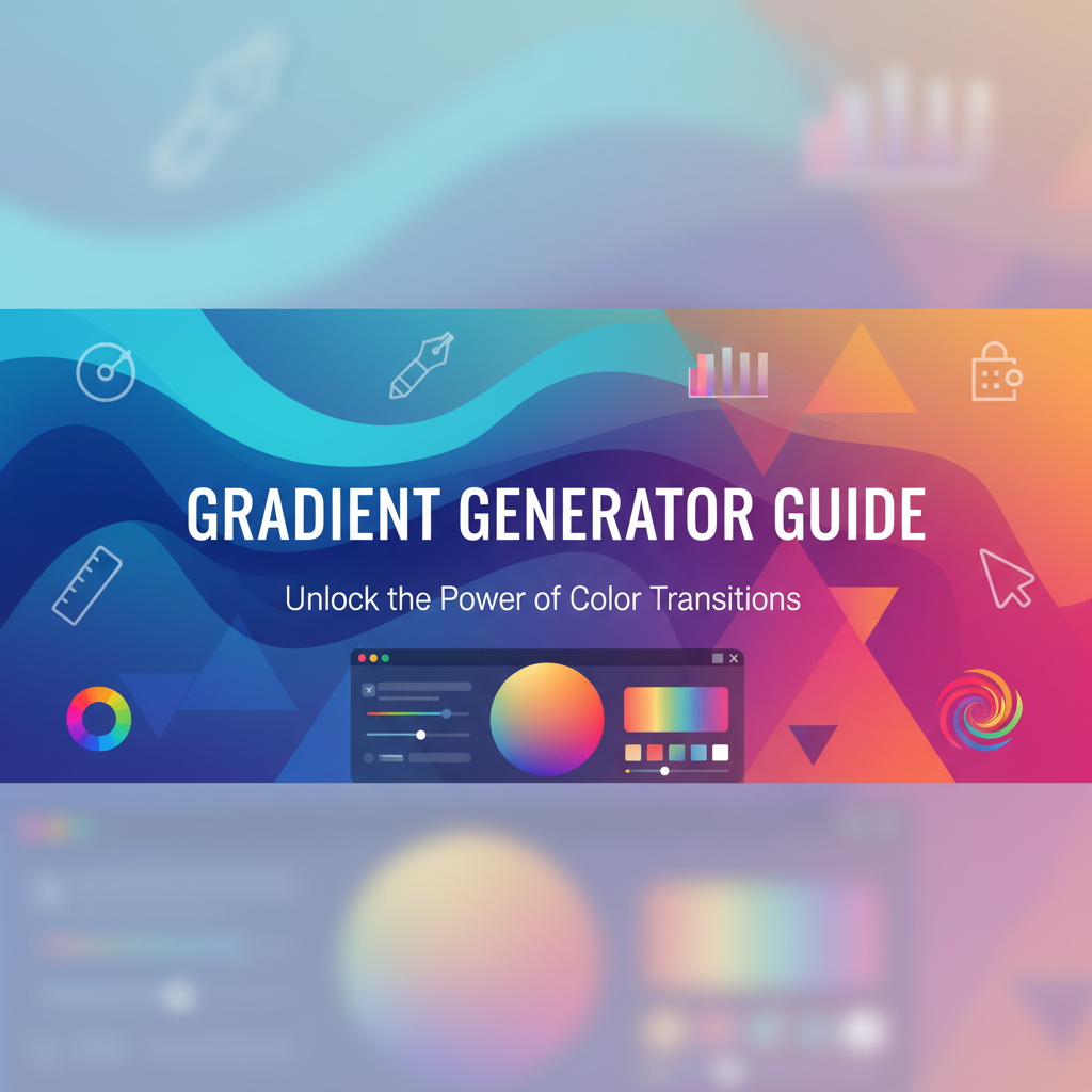
The Gradient Generator simplifies creating these effects by providing an intuitive visual interface that generates production-ready CSS code, making gradient creation accessible to developers and designers alike.
Background: The Evolution of CSS Gradients
The Pre-CSS3 Era
Before CSS3 introduced native gradient support, web designers relied entirely on image files for gradient effects. This workflow involved:
- Designing gradients in Photoshop or Illustrator
- Exporting as PNG or JPEG files
- Uploading images to the server
- Referencing them via
background-imagein CSS - Creating multiple versions for responsive breakpoints
This process was time-consuming, inflexible, and created maintenance nightmares. Even minor color adjustments required returning to design software, re-exporting, and re-uploading files. Furthermore, image-based gradients added to page weight—a 1200px × 800px gradient could easily exceed 50KB even when compressed.
The CSS3 Revolution (2008-2012)
CSS3 introduced gradient functions, first as experimental features with vendor prefixes. Early implementations varied across browsers:
/* 2009: Multiple vendor prefixes required */
background: -webkit-gradient(linear, left top, left bottom, from(#667eea), to(#764ba2));
background: -webkit-linear-gradient(top, #667eea, #764ba2);
background: -moz-linear-gradient(top, #667eea, #764ba2);
background: -o-linear-gradient(top, #667eea, #764ba2);
background: linear-gradient(to bottom, #667eea, #764ba2);
This vendor-prefix era required careful cross-browser testing and redundant code. Tools emerged to automate prefix generation, but the syntax remained fragmented.
Modern Standard Syntax (2012-Present)
By 2012, the CSS Working Group standardized gradient syntax with the CSS Images Module Level 3. Key improvements included:
- Unified Syntax: Consistent gradient functions across browsers
- Angle Notation: Standardized degree-based angle definitions
- Multiple Color Stops: Support for complex multi-color gradients
- Conic Gradients: Introduction of conic-gradient() in 2018
Today’s gradient syntax is remarkably clean:
background: linear-gradient(135deg, #667eea 0%, #764ba2 100%);Modern browsers handle gradients efficiently with hardware acceleration, and tools like the Ultimate CSS Gradient Generator & Editor make creation even more accessible.
The Three Gradient Types
Linear Gradients (linear-gradient()) transition colors along a straight line defined by an angle or direction keyword. They’re the most common gradient type, ideal for backgrounds, overlays, and directional emphasis.
Radial Gradients (radial-gradient()) radiate from a central point outward in circular or elliptical patterns. Perfect for spotlight effects, vignettes, and focal emphasis.
Conic Gradients (conic-gradient()) sweep colors around a center point like a color wheel or pie chart. Introduced later than linear and radial, they’re excellent for progress indicators, color pickers, and creative geometric patterns.
Each gradient type serves distinct visual purposes, and understanding when to use each is key to effective design.
Practical Workflows
Workflow 1: Rapid Prototyping with Visual Tools
Scenario: You’re designing a new landing page and need to quickly test several gradient background options to find the right aesthetic.
Steps:
- Open the Gradient Generator
- Browse preset gradients for inspiration or start from scratch
- Select linear gradient type with 135° angle
- Add first color stop: Choose a primary brand color (e.g.,
#667eea) - Add second color stop: Select complementary secondary color (e.g.,
#764ba2) - Adjust color positions on the slider for different transition points
- Copy generated CSS code to your stylesheet
- Test in browser and iterate as needed
Time Savings: Creating gradients visually takes seconds compared to manually writing and tweaking CSS values. Real-time preview eliminates guesswork, reducing the design iteration cycle from minutes to seconds.
Pro Tip: Save successful gradient combinations in a design system stylesheet for consistent reuse across projects.
Workflow 2: Building a Design System
Scenario: You’re establishing a comprehensive design system with standardized gradient patterns for backgrounds, cards, and interactive elements.
Steps:
- Define gradient categories (primary, secondary, accent, neutral)
- Use gradient tools to create base gradients for each category
- Export CSS and organize as CSS custom properties:
:root {
  /* Primary gradients */
  --gradient-primary: linear-gradient(135deg, #667eea 0%, #764ba2 100%);
  --gradient-primary-hover: linear-gradient(135deg, #7a8ef0 0%, #8b5db8 100%);

  /* Secondary gradients */
  --gradient-secondary: linear-gradient(180deg, #f093fb 0%, #f5576c 100%);

  /* Neutral gradients */
  --gradient-neutral: linear-gradient(to bottom, #fafafa 0%, #e0e0e0 100%);
}- Document usage guidelines and accessibility considerations
- Create component classes that reference these variables:
.hero-section {
  background: var(--gradient-primary);
  color: white;
  padding: 6rem 2rem;
}

.hero-section:hover {
  background: var(--gradient-primary-hover);
  transition: background 0.3s ease;
}Benefits: CSS custom properties enable centralized control over gradients. Updating a single variable automatically propagates changes throughout your entire application, ensuring visual consistency and simplifying maintenance.
Workflow 3: Gradient Overlays for Image Backgrounds
Scenario: You need to ensure text readability over hero images with varying brightness levels.
Steps:
- Create a semi-transparent gradient overlay using rgba colors:
.hero-image {
  position: relative;
  background-image: url('hero.jpg');
  background-size: cover;
  background-position: center;
}

.hero-image::before {
  content: '';
  position: absolute;
  inset: 0;
  background: linear-gradient(
    to bottom,
    rgba(0, 0, 0, 0.3) 0%,
    rgba(0, 0, 0, 0.7) 100%
  );
  z-index: 1;
}

.hero-content {
  position: relative;
  z-index: 2;
  color: white;
}- Adjust gradient opacity and direction based on image composition
- Test text contrast ratios to meet WCAG AA standards (4.5:1 minimum)
- Use browser DevTools to fine-tune gradient stops
Accessibility Note: Always verify text contrast when using gradient overlays. The Gradienta Pro: AI & CSS Gradient Editor includes built-in contrast checking features.
Workflow 4: Animated Gradient Backgrounds
Scenario: Create an engaging, animated gradient background for a splash screen or loading state.
Steps:
- Generate a multi-color gradient with 3-4 stops
- Set
background-sizelarger than container (e.g.,400% 400%) - Create CSS animation to shift
background-position:
.animated-gradient {
  background: linear-gradient(
    -45deg,
    #ee7752,
    #e73c7e,
    #23a6d5,
    #23d5ab
  );
  background-size: 400% 400%;
  animation: gradientShift 15s ease infinite;
}

@keyframes gradientShift {
  0% { background-position: 0% 50%; }
  50% { background-position: 100% 50%; }
  100% { background-position: 0% 50%; }
}- Adjust animation duration for desired effect speed
- Test performance on lower-end devices
Performance Consideration: Animating background-position can be GPU-intensive. Use will-change: background-position; to optimize rendering, but sparingly as it increases memory usage.
Workflow 5: Gradient Borders with Pseudo-Elements
Scenario: Create gradient borders for cards or buttons without affecting interior content.
Steps:
- Create gradient background on parent element
- Use pseudo-element to create inner content area with solid background:
.gradient-border-card {
  position: relative;
  background: linear-gradient(135deg, #667eea, #764ba2);
  padding: 2px; /* Border width */
  border-radius: 12px;
}

.gradient-border-card::before {
  content: '';
  position: absolute;
  inset: 2px; /* Matches padding */
  background: white;
  border-radius: 10px; /* Slightly smaller than parent */
  z-index: -1;
}- Adjust padding to control border thickness
- Match border-radius values for consistent appearance
This technique works well with the Border Radius Generator for creating sophisticated card designs with gradient borders and custom corner radii.
Comparisons: Manual Coding vs. Visual Tools
Manual CSS Coding
Advantages:
- Precision Control: Exact numeric values for stops, angles, and positions
- Version Control: Plain text CSS integrates seamlessly with Git workflows
- No Dependencies: Works anywhere without external tools
- Learning Opportunity: Deepens understanding of CSS gradient syntax
Disadvantages:
- Slow Iteration: Trial-and-error approach requires frequent browser refreshes
- Difficult Visualization: Hard to predict exact appearance without rendering
- Syntax Complexity: Easy to make mistakes with parentheses, commas, and units
- Limited Creativity: Harder to experiment with unconventional combinations
Best For: Developers comfortable with CSS who need precise, repeatable gradient definitions integrated into existing codebases.
Visual Gradient Generators
Advantages:
- Instant Feedback: See results in real-time as you adjust controls
- Easier Learning Curve: Visual interface accessible to designers without CSS expertise
- Faster Exploration: Quickly test dozens of combinations to find the right aesthetic
- Preset Libraries: Starting templates accelerate initial design
- Export Options: Generate ready-to-use CSS code instantly
Disadvantages:
- Tool Dependency: Requires external application or web service
- Potential Bloat: Generated code may include unnecessary vendor prefixes
- Limited Advanced Features: Some complex gradient patterns require manual coding
Best For: Rapid prototyping, design exploration, client presentations, and designers who prefer visual workflows.
The Hybrid Approach
Most professional workflows combine both methods:
- Design Phase: Use visual tools like the Gradient Generator to explore options and establish visual direction
- Refinement Phase: Fine-tune generated CSS manually for pixel-perfect precision
- System Integration: Convert finalized gradients to CSS custom properties for maintainability
- Documentation: Use visual previews in design systems to communicate gradient usage
This approach leverages the strengths of both methods: visual tools for creative exploration and manual coding for production optimization.
Best Practices
1. Optimize for Performance
Use Hardware-Accelerated Properties: When animating gradients, prefer transform and opacity over background-position where possible:
/* Less efficient */
.gradient-bg {
  background: linear-gradient(135deg, #667eea, #764ba2);
  transition: background 0.3s;
}

/* More efficient */
.gradient-bg::before {
  content: '';
  position: absolute;
  inset: 0;
  background: linear-gradient(135deg, #667eea, #764ba2);
  opacity: 0;
  transition: opacity 0.3s;
}

.gradient-bg:hover::before {
  opacity: 1;
}
Minimize Color Stops: Each additional color stop increases rendering complexity. Use only as many stops as necessary for your desired effect.
Consider Browser Rendering: Complex gradients on large surfaces can impact performance, especially on mobile devices. Profile with DevTools to identify bottlenecks.
2. Ensure Cross-Browser Compatibility
Include Fallbacks: Always provide solid color fallbacks for browsers that don’t support gradients (though extremely rare today):
.element {
  background: #667eea; /* Fallback */
  background: linear-gradient(135deg, #667eea 0%, #764ba2 100%);
}
Test Vendor Prefix Requirements: While modern browsers support unprefixed gradients, check your browser support matrix. Tools like Autoprefixer automate this.
Validate Conic Gradient Support: Conic gradients have more limited support. Use @supports for progressive enhancement:
.color-wheel {
  background: radial-gradient(circle, red, yellow, green); /* Fallback */
}

@supports (background: conic-gradient(red, yellow)) {
  .color-wheel {
    background: conic-gradient(red, yellow, green, blue, red);
  }
}
3. Prioritize Accessibility
Maintain Text Contrast: When placing text over gradients, ensure sufficient contrast across all gradient areas. WCAG AA requires 4.5:1 for normal text, 3:1 for large text.
Test with Color Blindness Simulators: Tools like ColorOracle help verify gradients remain distinguishable for users with color vision deficiencies.
Use Semantic HTML: Don’t rely on gradients alone to convey information. Supplement visual cues with text labels, ARIA attributes, or icons.
Avoid Gradient-Only Buttons: Ensure interactive elements have clear focus states beyond gradient changes:
.gradient-button {
  background: linear-gradient(135deg, #667eea, #764ba2);
  border: 2px solid transparent;
  transition: border-color 0.2s;
}

.gradient-button:focus {
  border-color: #fff;
  outline: 2px solid #000;
  outline-offset: 2px;
}
4. Design for Consistency
Establish Gradient Patterns: Define standard gradients in your design system and reuse them consistently. This creates visual cohesion and reinforces brand identity.
Document Usage Guidelines: Specify when to use each gradient type (primary vs. secondary, light vs. dark) and in what contexts.
Create Naming Conventions: Use descriptive names like --gradient-primary-diagonal rather than --gradient-1 for better maintainability.
5. Leverage Modern Features
Use CSS Custom Properties for Dynamic Gradients: Enable runtime gradient modifications with CSS variables:
:root {
  --gradient-angle: 135deg;
  --gradient-start: #667eea;
  --gradient-end: #764ba2;
}

.dynamic-gradient {
  background: linear-gradient(
    var(--gradient-angle),
    var(--gradient-start),
    var(--gradient-end)
  );
}
JavaScript can then update these values for interactive effects.
Combine with Modern CSS Features: Gradients work beautifully with backdrop-filter, clip-path, and CSS Grid for sophisticated layouts.
Case Study: Modern UI Design with Gradient Backgrounds
The Challenge
A SaaS startup needed to redesign their marketing website to stand out in a crowded market. Their previous design used flat, single-color backgrounds that felt dated compared to competitors. The design team wanted a modern, dynamic look that conveyed innovation and energy while maintaining professional credibility.
The Solution
The team leveraged CSS gradients extensively throughout the site redesign:
Hero Section: A vibrant diagonal linear gradient (linear-gradient(135deg, #667eea 0%, #764ba2 100%)) created immediate visual impact. The gradient’s purple-to-magenta transition aligned with the brand’s tech-forward identity while maintaining sophistication.
Feature Cards: Each product feature used subtle radial gradients emanating from card centers, drawing attention to key content areas. The gradients used low opacity (rgba(103, 126, 234, 0.1) to transparent) to avoid overwhelming text.
Call-to-Action Buttons: Multi-layer gradients with animated hover states created depth and interactivity. The base state used a two-color linear gradient, while hover added a semi-transparent radial overlay for a “lighting up” effect:
.cta-button {
  position: relative;
  background: linear-gradient(135deg, #667eea 0%, #764ba2 100%);
  transition: transform 0.2s;
}

.cta-button::before {
  content: '';
  position: absolute;
  inset: 0;
  background: radial-gradient(
    circle at center,
    rgba(255, 255, 255, 0.2) 0%,
    transparent 70%
  );
  opacity: 0;
  transition: opacity 0.2s;
}

.cta-button:hover::before {
  opacity: 1;
}

.cta-button:hover {
  transform: translateY(-2px);
}
Section Dividers: Subtle conic gradients created unique transitional elements between page sections, adding visual interest without distraction.
The Implementation Process
-
Design Exploration: Designers used the Gradient Generator to rapidly prototype gradient combinations, presenting 15+ options to stakeholders.
-
Brand Alignment: Selected gradients were tested against brand guidelines, ensuring color harmony and consistency with existing visual identity.
-
Accessibility Testing: All text-over-gradient combinations were verified with contrast ratio tools. Areas failing WCAG AA standards were adjusted by either darkening gradients or adding semi-transparent overlays.
-
Performance Optimization: Initial prototypes used animated
background-positionextensively, causing performance issues on mobile. The team refactored animations to usetransformandopacityproperties, improving frame rates from ~30 FPS to 60 FPS on mid-range devices. -
Cross-Browser Testing: The team discovered older Safari versions rendered conic gradients incorrectly. They implemented
@supportsqueries with radial gradient fallbacks, ensuring graceful degradation. -
Design System Integration: Final gradients were codified as CSS custom properties and documented in the company’s design system, enabling consistent usage across marketing materials and product interfaces.
The Results
- Engagement Increase: Average time on page increased by 37%, with user testing revealing gradients created a more “premium” perception
- Brand Differentiation: The distinctive gradient palette became a recognizable brand element, used consistently across social media and product interfaces
- Development Efficiency: Gradient design system reduced frontend development time for new landing pages by ~40%
- Performance Metrics: Despite rich visual effects, page load times improved by 15% compared to the previous image-heavy design
Key Takeaways
- Visual Tools Accelerate Iteration: Using gradient generators during the design phase enabled rapid exploration without developer bottlenecks
- Accessibility Cannot Be Afterthought: Contrast testing must happen early; retrofitting accessibility is more costly than building it in
- Performance Budget Matters: Even CSS effects require testing on target devices; what works on high-end laptops may struggle on budget smartphones
- Consistency Requires Systems: Without documented gradient patterns, visual consistency deteriorates as teams scale
- Progressive Enhancement Ensures Reach: Fallback strategies ensure all users receive functional experiences regardless of browser capabilities
This case study demonstrates how strategic use of CSS gradients, combined with thoughtful tooling and rigorous testing, can elevate visual design while maintaining technical excellence. For similar projects, starting with tools like the CSS Generator Suite can streamline the design-to-development workflow.
Call to Action
Ready to create stunning CSS gradients for your next project? The Gradient Generator provides an intuitive, visual interface for designing linear, radial, and conic gradients with instant CSS code output. Whether you’re a designer prototyping a new UI concept or a developer optimizing an existing site, this tool streamlines your workflow and unleashes your creativity.
Get Started Today:
- Explore the Tool: Visit the Gradient Generator and experiment with different gradient types
- Browse Advanced Features: Check out the Ultimate CSS Gradient Generator & Editor for preset galleries and PNG export options
- Build Complete Designs: Combine gradients with other design tools in the CSS Generator Suite
- Join the Community: Share your gradient creations and learn from other designers in the Gray-wolf Tools community forums
Additional Resources:
- Documentation: MDN Web Docs: CSS Gradients - Comprehensive technical reference
- Inspiration: UI Gradients - Curated collection of beautiful gradient combinations
- Learning: CSS-Tricks Gradient Guide - In-depth tutorials and advanced techniques
Transform your web design with the power of CSS gradients—no image files required, just pure, scalable, performant code. Start creating today!