Executive Summary
The Advanced Color Palette Generator solves one of the most persistent challenges in modern design workflows: creating harmonious, professional color schemes that maintain visual coherence across digital and print media. Traditional color selection methods often rely on subjective judgment or basic color wheels, leading to palettes that work in isolation but fail to create cohesive brand experiences. This tool transforms any image into a sophisticated color palette using advanced algorithms that identify dominant colors and generate comprehensive tints and shades, ensuring your designs maintain consistent depth and visual hierarchy.
The problem it addresses is fundamental to design work: achieving color harmony without extensive color theory knowledge. Designers and developers frequently struggle with creating palettes that feel intentional rather than accidental. The Advanced Color Palette Generator eliminates this guesswork by analyzing images and extracting scientifically balanced color relationships. Beyond extraction, it generates complete color families including tints (lighter versions) and shades (darker versions) for each base color, giving you the flexibility to create depth and emphasis in your designs.
The tool’s real-world impact becomes apparent when you consider the typical design workflow. Instead of spending hours experimenting with color combinations or relying on limited preset palettes, you can instantly transform any inspiring image—photographs, illustrations, artwork—into a professional color scheme ready for implementation. This approach not only accelerates your creative process but also ensures your color choices are grounded in proven visual relationships found in nature and successful design work.
Feature Tour & UI Walkthrough
The Advanced Color Palette Generator interface centers around three primary interaction zones designed for efficiency and creative flow. The central upload area accommodates drag-and-drop functionality with support for JPEG, PNG, and WebP formats up to 10MB, ensuring flexibility across different image sources. This generous file size limit accommodates high-resolution images necessary for accurate color analysis while maintaining optimal processing performance.
The algorithm processes your image through several sophisticated analytical stages. First, it identifies the dominant color clusters using advanced color clustering techniques that group similar hues, saturation levels, and brightness values. The system then ranks these clusters by prominence and visual weight, ensuring the extracted palette reflects the most impactful colors in your source image. This ranking system prevents minor background colors from overwhelming your primary palette selections.
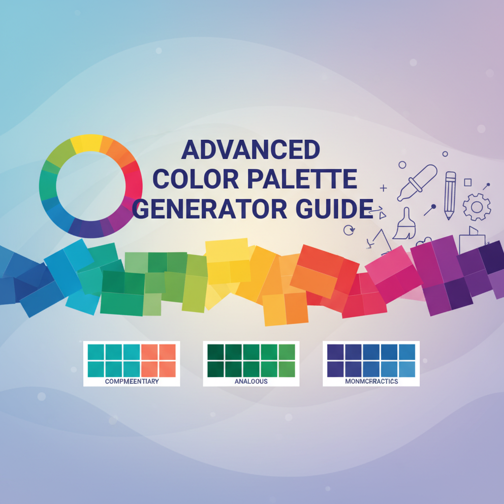
The palette display interface presents colors in order of visual importance, with each swatch showing multiple variations. Each base color entry includes the pure hue alongside three lighter tints and three deeper shades, creating a complete color family for design flexibility. The color swatches display both hex codes and RGB values, with copy-to-clipboard functionality that activates on hover, streamlining the integration process into your design tools.
Export functionality encompasses three distinct formats tailored to different workflow requirements. CSS variables provide immediate integration for web projects, automatically generating semantic naming conventions. SVG export creates scalable palette files for vector-based design applications and presentation materials. PNG export produces a visual reference document perfect for team collaboration and client presentations, maintaining color accuracy across different devices and print specifications.
The accessibility panel incorporates contrast ratio calculations between your extracted colors and both white and black backgrounds. This feature ensures your color palette not only looks beautiful but meets Web Content Accessibility Guidelines (WCAG) standards for text readability. Real-time contrast ratio updates help you make informed decisions about text placement and background selection during the design process.
Step-by-Step Usage Scenarios
Scenario 1: Creating Brand Colors from Logo Imagery
Upload your company’s logo or brand imagery to extract foundational colors that already carry your brand’s visual DNA. Begin by selecting a high-resolution logo image that represents your brand’s visual identity accurately. The algorithm identifies your primary brand colors alongside secondary supporting hues present in the logo design. Review the extracted palette, noting which colors align with your existing brand guidelines and which offer new creative possibilities. Export the palette as CSS variables for immediate implementation in your website’s stylesheet, ensuring consistent brand color application across digital touchpoints. This approach creates brand coherence that feels organic rather than forced, as the colors already exist within your visual identity system.
Scenario 2: Extracting Color Schemes from Photography for Marketing Materials
Transform compelling photography into cohesive marketing color schemes by uploading images that capture your desired mood or aesthetic. Select photographs that represent your target emotional response—warm sunset tones for energy-focused campaigns, cool ocean blues for calming wellness materials, or rich earth tones for sustainability messaging. Analyze the color distribution to understand which hues dominate the emotional impact of your selected imagery. Apply the extracted palette to your marketing materials, using the tints and shades to create visual hierarchy that guides viewer attention through your content structure. This method ensures your marketing materials feel authentically connected to the visual inspiration that drove your creative direction.
Scenario 3: Developing Design System Color Palettes from UI Inspiration
Create comprehensive design system color palettes by extracting colors from high-quality user interface designs or website screenshots that represent your desired aesthetic. Upload multiple reference images that collectively represent the visual language you want to achieve, then compare the extracted palettes to identify recurring color families and harmonious relationships. Use the generated tints and shades to establish your design system’s color tokens, ensuring each color family supports functional UI needs like primary actions, secondary elements, success states, and warning communications. Export the complete palette for implementation in your design system documentation, providing developers with precise color specifications for consistent UI development.
Code or Data Examples
Sample Palette Extraction from Natural Photography:
Consider this example of extracting colors from a forest landscape photograph:
- Primary Green:
#4A7C59(RGB: 74, 124, 89) - dominant tree foliage - Secondary Brown:
#8B6F47(RGB: 139, 111, 71) - tree bark and earth - Accent Blue:
#6B8CAE(RGB: 107, 140, 174) - sky reflections and water - Neutral Gray:
#A8A5A5(RGB: 168, 165, 165) - rocks and shadows
CSS Variables Export Example:
:root {
  --color-primary-green: #4A7C59;
  --color-primary-green-tint-1: #6B8F6E;
  --color-primary-green-tint-2: #8DA383;
  --color-primary-green-tint-3: #AFB798;
  --color-primary-green-shade-1: #3A6247;
  --color-primary-green-shade-2: #2A4935;
  --color-primary-green-shade-3: #1A3023;

  --color-secondary-brown: #8B6F47;
  --color-secondary-brown-tint-1: #A08763;
  --color-secondary-brown-tint-2: #B59F7F;
  --color-secondary-brown-tint-3: #CAB79B;
  --color-secondary-brown-shade-1: #6F5739;
  --color-secondary-brown-shade-2: #533F2B;
  --color-secondary-brown-shade-3: #37271D;
}
Accessibility Implementation Example:
/* Primary green with white text - contrast ratio: 4.2:1 (AA compliant) */
.button-primary {
  background-color: var(--color-primary-green);
  color: #FFFFFF;
  padding: 12px 24px;
  border-radius: 6px;
  font-weight: 500;
}

/* Secondary brown with black text for better readability */
.text-secondary {
  color: var(--color-secondary-brown);
  background-color: var(--color-primary-green-tint-3);
  padding: 16px;
  border-radius: 4px;
}
Troubleshooting & Limitations
Issue: Colors appear too similar or lack distinction
If your extracted palette shows insufficient color variation, try uploading images with more diverse color content. The algorithm works best with images containing clearly differentiated color regions. High-contrast imagery produces more distinct palettes, while low-contrast or monochrome images may generate overly similar color families. Consider using images with multiple distinct color areas rather than gradients or subtle color variations.
Issue: Unexpected color dominance in palette
When background colors overwhelm your intended primary colors, crop your image to focus on the most important color areas before upload. The algorithm considers the entire image composition, so large background areas can skew the color distribution. Strategic cropping allows you to emphasize specific color regions while minimizing the impact of supporting elements.
Issue: Exported colors don’t match display accuracy
Color accuracy depends on your source image’s color profile and your output device’s display calibration. Always preview your palette on the intended display device before final implementation. Consider color-managed workflows for professional applications requiring precise color reproduction across different devices and print specifications.
Performance considerations with large files
Images larger than 10MB may experience slower processing times. While the tool accepts high-resolution images, consider optimizing file sizes for faster analysis while maintaining sufficient detail for accurate color extraction. Large photographic files benefit from compression that preserves color information while reducing processing overhead.
Color profile compatibility
The tool assumes standard sRGB color space for consistent results. Images using non-standard color profiles may require conversion before upload to ensure accurate color representation in the extracted palette. Adobe RGB or ProPhoto RGB images should be converted to sRGB before processing for optimal color accuracy.
Frequently Asked Questions
Can I use the palette generator for print design projects?
Absolutely. The extracted palettes work exceptionally well for print design when you convert the hex values to CMYK using professional color management software. The tints and shades become particularly valuable for print applications where color control and consistency are critical. Consider using the PNG export for client presentations and the CSS variables for digital mockups that complement your print materials.
How does the algorithm handle images with multiple color schemes?
The algorithm prioritizes colors based on visual prominence and coverage area within your image. If your image contains distinct color regions (like a blue sky over green landscape), you’ll see both color families represented in your palette. The ranking system ensures the most visually significant colors appear first, giving you control over which colors to emphasize in your design application.
What’s the difference between tints, shades, and the original color?
Tints are created by adding white to the base color, creating lighter variations that work well for backgrounds, hover states, and subtle emphasis. Shades result from adding black to the base color, producing deeper variations ideal for text, borders, and dramatic emphasis. The original base color maintains the pure hue extracted from your image, serving as your primary brand or design color.
Can I generate palettes from images on my mobile device?
Yes, the tool works with mobile browser uploads. For best results, ensure your image is well-lit and contains distinct color areas. Mobile photos often work better when cropped to focus on the most important color content rather than including the entire scene. The tool’s responsive design adapts to mobile interfaces while maintaining full functionality.
How accurate are the color matches between extracted and original colors?
Color extraction accuracy depends on source image quality and color profile. The algorithm uses sophisticated color analysis to identify the closest matching colors while maintaining the visual relationships found in your original image. For critical applications requiring precise color reproduction, consider color-calibrated workflows and professional color management tools.
References & Internal Links
For comprehensive color theory and implementation guidance, explore these related Gray-wolf Tools resources:
- Universal Color Converter & Palette Tool - Master color format conversions and accessibility compliance with our companion color analysis tool
- Ultimate CSS Gradient Generator & Editor - Extend your palette mastery with gradient creation techniques that build upon extracted color relationships
- CSS Generator Suite - Implement your color choices across complete CSS projects with shadow generators, border tools, and layout utilities
- Design & Frontend Tools Overview - Discover additional color management and design utilities that complement palette generation workflows
- Advanced Color Theory Guide - Deepen your understanding of color relationships and harmony principles that enhance extracted palette applications
The Advanced Color Palette Generator serves as the foundation for professional color management in modern design workflows. Whether you’re establishing brand guidelines, creating marketing materials, or developing comprehensive design systems, this tool provides the scientific color analysis and comprehensive palette generation needed for consistent, impactful visual communication. Start with inspiration imagery, extract balanced color families, and implement professional color schemes that elevate your creative work across all media.