Problem-Focused Introduction
Designers and developers face a persistent challenge in modern creative workflows: creating color schemes that feel intentional, professional, and maintain visual coherence across multiple touchpoints. Traditional approaches to color selection often rely on subjective judgment, limited preset libraries, or complex color theory that requires extensive knowledge to implement effectively. This fragmentation leads to design inconsistencies, brand confusion, and significant time investment in perfecting color relationships that should feel natural and effortless.
The core problem extends beyond simple aesthetic choices. Organizations struggle to maintain consistent brand identity across digital and print media, while individual designers grapple with creating palettes that support user experience goals rather than competing with content hierarchy. The financial impact becomes apparent when considering the hours spent adjusting color relationships, the risk of accessibility violations, and the potential for brand dilution when multiple stakeholders make independent color decisions.
Modern design projects require color systems that can scale across platforms, adapt to various contexts, and support both aesthetic appeal and functional requirements. Whether establishing brand guidelines for a growing startup, creating marketing materials that resonate with target audiences, or developing design systems that hundreds of developers will implement, the need for scientifically-backed color generation tools has never been more critical. The Advanced Color Palette Generator addresses these challenges by extracting proven color relationships from inspiring imagery and providing comprehensive palette families that maintain visual harmony while supporting diverse design applications.
Background & Concepts
Color palette generation from images leverages principles established in both color theory and computational analysis. The scientific foundation rests on understanding how human perception interprets color relationships and how digital algorithms can replicate these natural harmonies. When we observe successful imagery—nature photography, artwork, well-designed interfaces—we’re unconsciously processing complex color interactions that follow predictable mathematical relationships.
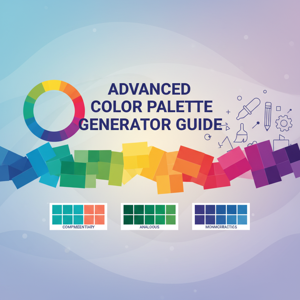
Johannes Itten’s color theory, developed in the early 20th century, established fundamental principles of color harmony that remain relevant in digital design today. His work identified how colors relate through hue, saturation, and brightness variations, creating emotional and visual responses that can be systematically reproduced. Modern color extraction algorithms build upon these foundations, using clustering techniques to identify dominant color families and generate complete tone ranges that maintain psychological and aesthetic impact.
The computational approach involves several sophisticated processes. Color space analysis converts pixel information into perceptually meaningful color clusters, considering not just individual color values but their relationships within the broader image composition. Statistical analysis determines color prominence based on coverage area, contrast relationships, and visual weight distribution. The algorithm then generates comprehensive color families by systematically adjusting lightness and saturation values while maintaining the essential hue relationships that create visual harmony.
Contemporary applications extend far beyond traditional design contexts. Brand identity development, user interface design, marketing material creation, and even architectural visualization benefit from systematic color extraction methodologies. The ability to transform any inspiring visual content into professional color schemes democratizes access to sophisticated design capabilities, enabling creators with varying color theory expertise to achieve results that would previously require extensive training and experience.
Practical Workflows
Workflow 1: Brand Color System Development
Begin with comprehensive brand imagery that represents your organization’s visual identity. This includes logos, photography from marketing campaigns, product imagery, and even environmental photography that captures your brand’s emotional essence. Upload these images systematically to the Advanced Color Palette Generator, documenting each extracted palette and noting recurring color families across different source materials.
Analyze the extracted palettes to identify consistent color relationships that appear across multiple brand touchpoints. These recurring patterns indicate authentic brand color DNA rather than arbitrary aesthetic choices. Create a master palette that combines the most representative colors from your analysis, ensuring your brand colors support both emotional resonance and functional design requirements.
Implement your brand palette across digital touchpoints using CSS custom properties, creating semantic color tokens that separate visual appearance from functional purpose. Define primary brand colors for main actions and navigation, secondary colors for supporting elements, and neutral colors for backgrounds and text. Use the generated tints and shades to create proper visual hierarchy that guides user attention while maintaining accessibility compliance.
Workflow 2: Marketing Campaign Color Strategy
Select imagery that captures your campaign’s emotional objectives—whether energizing performance messaging using warm, high-saturation tones or creating calming trust through cool, desaturated color families. Use the Advanced Color Palette Generator to extract color schemes that authentically connect your visual messaging to the emotional responses you want to evoke.
Develop campaign-specific color implementations that maintain brand consistency while adapting to campaign objectives. Create variations of your brand palette using the tints and shades generation feature, allowing for seasonal adaptations, product-specific implementations, and demographic targeting while preserving overall brand recognition. This approach enables creative flexibility without sacrificing brand coherence.
Document your campaign color usage with specific implementation guidelines that ensure consistent reproduction across different media. Include contrast ratio requirements, minimum font sizes for different color combinations, and accessibility considerations that protect inclusive user experiences. Provide developers with clear specifications for both digital implementations and print adaptations.
Workflow 3: Design System Color Architecture
Establish comprehensive color systems for large-scale design projects by analyzing multiple reference images that represent your desired visual language. This might include competitor analysis imagery, inspirational design collections, and target demographic visual preferences. Extract palettes from each reference source and identify common color families that create your intended aesthetic.
Create hierarchical color token systems that separate base color definitions from functional usage specifications. Use the Advanced Color Palette Generator’s tints and shades to establish comprehensive tone scales that support everything from subtle background variations to dramatic emphasis elements. Define semantic color tokens that clearly communicate functional purpose while maintaining flexibility for future adaptation.
Implement your color system using progressive enhancement principles, ensuring core functionality works with minimal color dependencies while advanced features leverage your complete palette. Include automated accessibility testing that validates color combinations meet WCAG guidelines, preventing accessibility regressions as your system evolves.
Comparative Analysis
Traditional color selection methods present several limitations compared to image-based palette generation. Color wheel approaches, while providing scientific color relationships, often produce palettes that feel artificial or lack the nuanced complexity found in natural imagery. Preset palette libraries, though convenient, limit creative exploration and may not align with specific brand personalities or project requirements. Manual color experimentation, while offering complete creative control, requires extensive color theory knowledge and significant time investment for professional results.
The Advanced Color Palette Generator offers distinct advantages over alternative approaches. Scientific color analysis ensures palettes reflect proven visual relationships found in successful imagery, eliminating guesswork in color selection. The ability to generate complete color families including tints and shades provides comprehensive design flexibility without requiring extensive color mixing knowledge. Real-time palette generation enables rapid iteration and exploration, supporting agile design methodologies that require quick visual feedback.
Cost-effectiveness becomes apparent when considering the alternative of hiring color consultants or investing in expensive color analysis software. The tool democratizes access to professional color analysis capabilities, enabling individual designers and small teams to achieve results that previously required specialized expertise or significant financial investment. The comprehensive export options ensure compatibility with existing design workflows while providing new creative possibilities.
Comparison with other color generation tools reveals specific strengths in the Advanced Color Palette Generator’s approach. Many alternative tools focus solely on color harmony relationships without considering source imagery context, limiting their ability to create authentic brand connections. Others provide limited export options or require complex integration processes that hinder practical implementation. The combination of image analysis, comprehensive palette generation, and multiple export formats provides a complete solution for professional color management.
Best Practices & Pitfalls
Image Selection Strategy
Choose high-quality source imagery that represents your intended aesthetic with clarity and intention. Avoid low-resolution images, heavily filtered photography, or imagery with extreme color manipulation that may not reflect realistic color relationships. The best source images contain distinct color areas with sufficient contrast to allow the algorithm to identify meaningful color clusters rather than gradient transitions.
Consider the context and purpose of your imagery selection. Brand palette development benefits from diverse source imagery that captures different aspects of your brand personality, while campaign-specific projects may benefit from focused imagery that directly represents your target emotional response. Environmental photography often provides more complex and interesting color relationships than studio photography, creating palettes with greater visual sophistication.
Palette Validation and Testing
Always test extracted palettes across different contexts and applications before final implementation. Generate your palette from source imagery, then validate color choices across various lighting conditions, display types, and usage scenarios. Consider how your palette performs in both digital and print applications, ensuring color relationships maintain their intended impact across different reproduction methods.
Implement your palette gradually, starting with secondary applications before committing to primary brand elements. This approach allows you to identify potential issues with color relationships, accessibility concerns, or implementation challenges before they impact core brand elements. Document any necessary adjustments and maintain consistency in your color application across different touchpoints.
Common Implementation Mistakes
Avoid over-reliance on any single extracted color family. While the algorithm identifies dominant colors from your source imagery, successful design applications typically require balance between multiple color families. Use the complete palette including tints and shades rather than relying solely on the base colors, ensuring proper visual hierarchy and functional color differentiation.
Don’t ignore accessibility requirements when implementing your extracted palette. The Advanced Color Palette Generator provides contrast ratio information to support accessible implementations, but this data is only valuable if you actively apply it to your design decisions. Prioritize text readability and functional color differentiation over pure aesthetic preferences, ensuring your palette supports inclusive user experiences.
Documentation and Maintenance
Create comprehensive documentation for your palette implementations that includes usage guidelines, accessibility specifications, and maintenance procedures. Establish clear procedures for updating palettes when source imagery changes or when extending color families for new applications. Maintain version control for your color implementations, documenting changes and their rationale for future reference.
Consider long-term palette evolution strategies that allow for growth and adaptation while maintaining brand coherence. Plan for seasonal adaptations, product line extensions, and demographic variations that may require palette adjustments while preserving core brand recognition elements.
Case Study or Extended Example
A mid-sized technology startup approached color palette development with limited design resources and significant brand consistency challenges. Their existing color choices varied widely across different touchpoints, creating confusion in customer interactions and weakening brand recognition. The marketing team relied on subjective color preferences, while the development team used inconsistent color codes, resulting in a fragmented visual identity that failed to communicate the company’s professional competence.
The solution involved systematic palette development using the Advanced Color Palette Generator across multiple brand touchpoints. The team selected high-quality imagery representing their ideal brand personality: clean, modern technology environments; professional team photography; and product imagery that showcased their innovative capabilities. Each image was processed through the palette generator, with extracted color families analyzed for consistency and brand alignment.
The resulting palette revealed unexpected color relationships that authentically represented the company’s personality. Cool blues and grays dominated their professional imagery, while warm accent colors appeared in product photography that highlighted their user-friendly approach. This insight led to a more sophisticated color strategy that balanced professional credibility with approachable innovation.
Implementation began with website redesign using the extracted palette as CSS custom properties. The development team created semantic color tokens that separated visual appearance from functional purpose, ensuring consistent implementation across all digital touchpoints. Marketing materials adopted the palette for campaign consistency while maintaining creative flexibility through strategic use of tints and shades.
Results measured six months after implementation showed significant brand consistency improvements and customer engagement metrics. Brand recognition testing indicated improved visual coherence across touchpoints, while customer feedback highlighted increased trust and professionalism perceptions. Internal team efficiency improved as developers could quickly implement consistent color specifications without design consultations.
The case demonstrates how systematic palette development can transform brand identity while providing practical implementation benefits. The startup achieved professional color strategy results with minimal resource investment, creating a foundation for scalable brand growth that supports both current needs and future expansion opportunities.
Call to Action & Further Reading
Transform your design workflow with professional color palette generation that eliminates guesswork and accelerates creative development. The Advanced Color Palette Generator provides the foundation for consistent, impactful color strategies across all your design projects, from brand development to user interface design. Experience how scientific color analysis can elevate your creative work while maintaining the flexibility needed for diverse applications.
Continue your color mastery journey with complementary Gray-wolf Tools that extend palette generation into comprehensive design systems. The Universal Color Converter & Palette Tool provides advanced color format conversions and accessibility validation for your extracted palettes. Ultimate CSS Gradient Generator & Editor builds upon your color foundations to create sophisticated gradient implementations that enhance visual depth and user engagement.
Explore advanced color implementation strategies with the CSS Generator Suite, which translates your color choices into comprehensive CSS implementations including shadows, borders, and layout utilities. For complex design systems requiring nuanced visual relationships, the Layered Box-Shadow Generator provides advanced depth and dimension techniques that complement your color palette strategies.
Expand your design methodology with our comprehensive Design & Frontend Tools Overview, which maps complete color and design workflows across the entire Gray-wolf Tools ecosystem. Deepen your theoretical understanding with Design Best Practices & Implementation Guide, providing strategic frameworks for color system development and maintenance that scale across organizations and project types.