Executive Summary
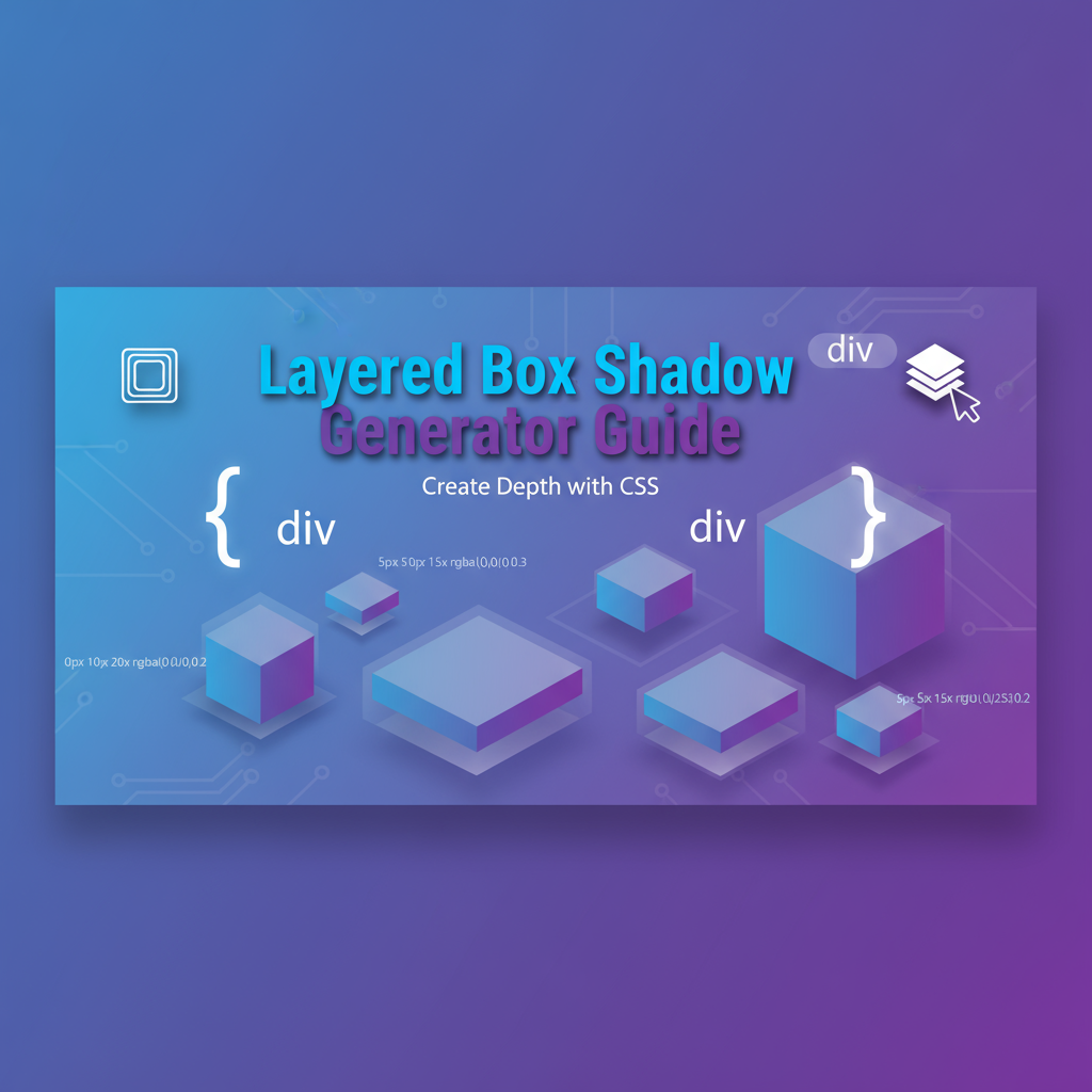
The Layered Box-Shadow Generator is a professional CSS design studio that empowers developers and designers to create sophisticated shadow effects through an intuitive visual interface. Unlike basic shadow tools, this advanced generator supports unlimited shadow layers, each with precise control over offset, blur, spread, and color properties.
Key capabilities:
- Multi-layer shadow composition: Stack multiple shadows for realistic depth and complex lighting effects
- Preset gallery: Instant access to curated shadow styles including neumorphism, material design, and soft UI
- Real-time preview: See changes instantly as you adjust sliders and color pickers
- Production-ready code: Copy clean, cross-browser compatible CSS immediately
- Layer management: Reorder, duplicate, or delete shadow layers with drag-and-drop ease
Who benefits most:
- UI/UX designers creating depth in flat design systems
- Frontend developers implementing design specifications
- Product teams exploring neumorphic and modern UI trends
- Students learning CSS visual effects
The tool solves a critical pain point: visualizing how shadow parameters interact to create specific visual outcomes. Instead of endless code tweaking, designers achieve pixel-perfect shadows in minutes through direct manipulation.
Feature Tour & UI Walkthrough
The Control Panel
Layer List (Left Sidebar)
- Add Layer Button: Creates new shadow layer with default values
- Layer Cards: Each displays current shadow parameters at a glance
- Visual color swatch
- Offset and blur values
- Delete and duplicate icons
- Drag Handles: Reorder layers to change stacking order (bottom layer renders first)
Shadow Property Controls (Center Panel) Each active layer exposes five precise controls:
-
Horizontal Offset (X)
- Range: -50px to +50px
- Negative values cast shadow to the left
- Positive values cast shadow to the right
- Keyboard: Arrow keys for 1px increments
-
Vertical Offset (Y)
- Range: -50px to +50px
- Negative values cast shadow upward
- Positive values cast shadow downward
- Common pattern: Match X offset for consistent light source angle
-
Blur Radius
- Range: 0px to 100px
- 0px creates sharp, hard-edged shadow
- Higher values create softer, more diffused shadows
- Performance note: Higher blur values increase rendering cost
-
Spread Radius
- Range: -50px to +50px
- Positive values expand shadow size before blur
- Negative values contract shadow size
- Critical for neumorphism: Use negative spread to keep shadows tight
-
Shadow Color & Opacity
- Full color picker with alpha channel
- Quick presets: Black, gray, theme colors
- Opacity slider: 0% (invisible) to 100% (solid)
- Pro tip: Most shadows look best at 10-30% opacity
Preview Window (Right Panel)
- Live Element: Interactive box showing current shadow in real-time
- Background Options: Toggle light/dark backgrounds to test contrast
- Size Controls: Adjust preview element dimensions
- Copy Code Button: Instantly copy generated CSS to clipboard
Preset Gallery
Access professionally designed shadow presets for instant implementation:
Neumorphic Soft UI
- Light Source: Top-left
- Layers: Two shadows (light and dark) creating extruded effect
- Best on: Light gray backgrounds (#e0e0e0 to #f0f0f0)
Material Design Elevation
- Depth levels: 1dp through 24dp
- Combines ambient and directional shadows
- Standard for Google Material Design compliance
Inner Shadows
- Creates recessed, carved appearance
- Uses
insetkeyword (note: requires manual addition for now) - Perfect for input fields and wells
Glow Effects
- Zero offset, high blur
- Bright colors at medium opacity
- Popular for buttons and focus states
Classic Drop Shadow
- Single layer, slight offset, medium blur
- Timeless and subtle
- Safe default for cards and panels
Step-by-Step Usage Scenarios
Scenario 1: Creating a Neumorphic Button
Goal: Design a soft, embossed button that appears to emerge from the background
Step 1: Set your background color
- Choose a light gray: #e0e0e0
- Apply to both your page and the preview background
Step 2: Add the light shadow
- Click “Add Layer”
- Set Offset X: -8px, Offset Y: -8px
- Blur: 15px, Spread: 0px
- Color: White (#ffffff) at 70% opacity
Step 3: Add the dark shadow
- Click “Add Layer” again
- Set Offset X: 8px, Offset Y: 8px
- Blur: 15px, Spread: 0px
- Color: Dark gray (#a3a3a3) at 20% opacity
Step 4: Verify the effect
- The button should appear to rise slightly from the surface
- Shadows should be subtle, not dramatic
- Toggle dark mode to ensure it still works
Step 5: Copy and apply CSS
- Click “Copy Code”
- Add to your
.btn-neumorphicclass - Combine with matching background-color
Result: A professional neumorphic button ready for production.
Scenario 2: Material Design Card Shadow
Goal: Create standard Material Design elevation for a card component
Step 1: Select Material Design preset
- Choose “Elevation 8dp” from gallery
- This creates two pre-configured shadow layers
Step 2: Understand the layer structure
- Layer 1 (Ambient shadow):
- Offset: 0px, 4px
- Blur: 6px
- Color: Black at 14% opacity
- Layer 2 (Directional shadow):
- Offset: 0px, 1px
- Blur: 3px
- Color: Black at 12% opacity
Step 3: Customize if needed
- Adjust opacity for lighter/darker surfaces
- Modify Y-offset for different light angles
- Keep blur ratios consistent for realistic depth
Step 4: Export for hover states
- Duplicate the configuration
- Increase offsets and blur by ~50% for elevated hover state
- Add smooth transition in your CSS
Scenario 3: Debugging Shadow Render Issues
Problem: Shadow appears blocky or shows visible edges
Diagnosis steps:
- Check blur radius: Increase to at least 10px for smooth edges
- Verify spread is not too large: Excessive spread creates hard edges
- Adjust color opacity: Lower opacity often smooths visual harshness
- Test on different backgrounds: Some shadows only visible on contrasting backgrounds
Solution pattern:
- Start with blur at 2x the offset distance
- Keep spread at 0 or slightly negative
- Use semi-transparent colors (20-40% opacity for dark shadows)
Code Examples & Implementation
Basic Two-Layer Shadow
/* Light and dark neumorphic shadows */
.neumorphic-card {
  background: #e0e0e0;
  border-radius: 12px;
  padding: 24px;
  box-shadow: -8px -8px 15px rgba(255, 255, 255, 0.7),
              8px 8px 15px rgba(163, 163, 163, 0.2);
}
How to use:
- Generate shadow in the tool
- Copy the
box-shadowproperty - Apply to any element with a background
- Ensure background color matches design system
Material Design Elevation System
/* Systematic elevation scale */
:root {
  --elevation-1: 0 1px 3px rgba(0,0,0,0.12), 0 1px 2px rgba(0,0,0,0.24);
  --elevation-2: 0 3px 6px rgba(0,0,0,0.15), 0 2px 4px rgba(0,0,0,0.12);
  --elevation-3: 0 10px 20px rgba(0,0,0,0.15), 0 3px 6px rgba(0,0,0,0.10);
  --elevation-4: 0 15px 25px rgba(0,0,0,0.15), 0 5px 10px rgba(0,0,0,0.05);
  --elevation-5: 0 20px 40px rgba(0,0,0,0.2);
}

.card-low { box-shadow: var(--elevation-1); }
.card-medium { box-shadow: var(--elevation-2); }
.card-high { box-shadow: var(--elevation-3); }
Implementation tip: Define elevation levels as CSS custom properties for consistent application across components.
Inset Shadow for Input Fields
/* Recessed input appearance */
.input-well {
  background: #f5f5f5;
  border: 1px solid #ddd;
  border-radius: 8px;
  padding: 12px;
  box-shadow: inset 2px 2px 5px rgba(0, 0, 0, 0.1);
}Note: The inset keyword is not currently adjustable in the generator UI. Add it manually to the beginning of your shadow declaration to flip the shadow inward.
Animated Hover Elevation
.card {
  box-shadow: 0 2px 8px rgba(0, 0, 0, 0.1);
  transition: box-shadow 0.3s ease, transform 0.3s ease;
}

.card:hover {
  box-shadow: 0 8px 24px rgba(0, 0, 0, 0.15);
  transform: translateY(-4px);
}Technique: Generate two shadow configurations—one for default state, one for hover. Combine with transform for enhanced effect.
Troubleshooting & Limitations
Common Issues
Issue 1: Shadow not visible
- Cause: Shadow color too transparent or matches background
- Fix: Increase opacity to at least 10%, use contrasting color
Issue 2: Performance lag with many layers
- Cause: Each shadow layer increases GPU rendering work
- Fix: Limit to 3-4 layers maximum for production, combine similar layers
Issue 3: Shadow appears jagged/pixelated
- Cause: Insufficient blur radius for the offset distance
- Fix: Increase blur to at least equal the offset distance
Issue 4: Inconsistent appearance across browsers
- Cause: Older browsers may render shadows differently
- Fix: Test in target browsers, consider vendor prefixes for legacy support
Current Limitations
- Inset shadows: Must add
insetkeyword manually to CSS - Asymmetric blur: CSS doesn’t support different horizontal and vertical blur
- Shadow-only elements: Requires element with background; transparent backgrounds don’t show shadows
- Export formats: Currently CSS only; no SCSS or Less variable export
Browser Compatibility
Full Support (No prefixes needed):
- Chrome 4+
- Firefox 3.5+
- Safari 5.1+
- Edge (all versions)
- Opera 10.5+
Legacy Support (Use prefixes):
-webkit-box-shadow: 0 2px 8px rgba(0,0,0,0.1);
-moz-box-shadow: 0 2px 8px rgba(0,0,0,0.1);
box-shadow: 0 2px 8px rgba(0,0,0,0.1);
Accessibility Considerations
- Color alone is insufficient: Shadows enhance depth but shouldn’t be the only indicator of interactivity
- High contrast mode: Shadows may be ignored; ensure borders or backgrounds provide sufficient visual structure
- Motion sensitivity: Avoid animating shadows rapidly; respect
prefers-reduced-motion
Frequently Asked Questions
How many shadow layers should I use?
Answer: For most UI components, 2-3 layers are optimal. More layers increase visual sophistication but also rendering cost. Use cases:
- 1 layer: Simple drop shadows, subtle depth
- 2 layers: Neumorphism, Material Design elevation (ambient + directional)
- 3-4 layers: Complex lighting simulations, artistic effects
- 5+ layers: Rarely necessary; consider alternative techniques like SVG filters
What’s the difference between blur and spread?
Blur Radius: Controls how soft the shadow edges appear. Higher blur creates gradual fade from opaque to transparent.
Spread Radius: Expands or contracts the shadow size before blur is applied. Positive spread makes shadows larger; negative spread makes them smaller. Think of spread as adjusting the light source distance.
How do I create inward (inset) shadows?
Add the inset keyword to the beginning of your box-shadow declaration:
box-shadow: inset 0 2px 4px rgba(0, 0, 0, 0.1);The generator doesn’t currently have a toggle for this, so copy the generated CSS and manually prepend inset.
Can I animate box-shadow smoothly?
Yes, but with caveats. Box-shadow is animatable, but can cause performance issues on complex shadows. Best practices:
- Limit to 1-2 shadow layers for animated elements
- Use
transition: box-shadow 0.3s ease(notall) - Consider animating
opacityortransforminstead for better performance - Use
will-change: box-shadowsparingly and only during interaction
Why doesn’t my shadow show on a transparent background?
Box-shadow requires an element with a background color to be visible. The shadow is painted behind the element. For shadows on transparent elements, consider:
- Adding a semi-transparent background color
- Using
filter: drop-shadow()instead (different syntax, similar effect) - Placing the element over a contrasting background
What’s the best shadow for dark mode?
For dark backgrounds, adjust your shadow approach:
- Use lighter shadows (white or gray) at very low opacity (5-15%)
- Reduce offsets to prevent shadows from appearing too strong
- Consider reversing light source (shadows above instead of below)
- Example:
box-shadow: 0 -2px 10px rgba(255, 255, 255, 0.05);
How do I export shadows for design handoff?
- Generate your shadow in the tool
- Copy the CSS
box-shadowproperty value - Document in design system:
- Variable name (e.g.,
--shadow-card-elevated) - Use case description
- Screenshot of example usage
- Variable name (e.g.,
- Share CSS snippet with developers
- Consider creating matching Figma shadow styles with same parameters
References & Further Learning
Internal Gray-wolf Tools
- CSS Generator Suite: Comprehensive CSS effect generators including text-shadow, gradients, transforms
- Text Shadow Generator: Specialized tool for typography shadow effects
- Gradienta Pro: AI & CSS Gradient Editor: AI-powered gradient creation to complement shadow effects
- Ultimate CSS Gradient Generator & Editor: Create backgrounds that pair perfectly with layered shadows
External Resources
- MDN Web Docs: box-shadow CSS Property - Comprehensive syntax reference
- CSS-Tricks: Designing Neumorphic Elements - Deep dive into soft UI design patterns
- Material Design: Elevation Guidelines - Official Google shadow specifications
- Can I Use: Box-shadow Browser Support - Up-to-date compatibility table
Design Inspiration
- Dribbble: Search “neumorphism” or “soft UI” for design examples
- Behance: UI design projects showcasing creative shadow usage
- CodePen: Interactive shadow examples and experiments
Master layered shadows today: Visit the Layered Box-Shadow Generator and transform your UI with professional depth and dimension.