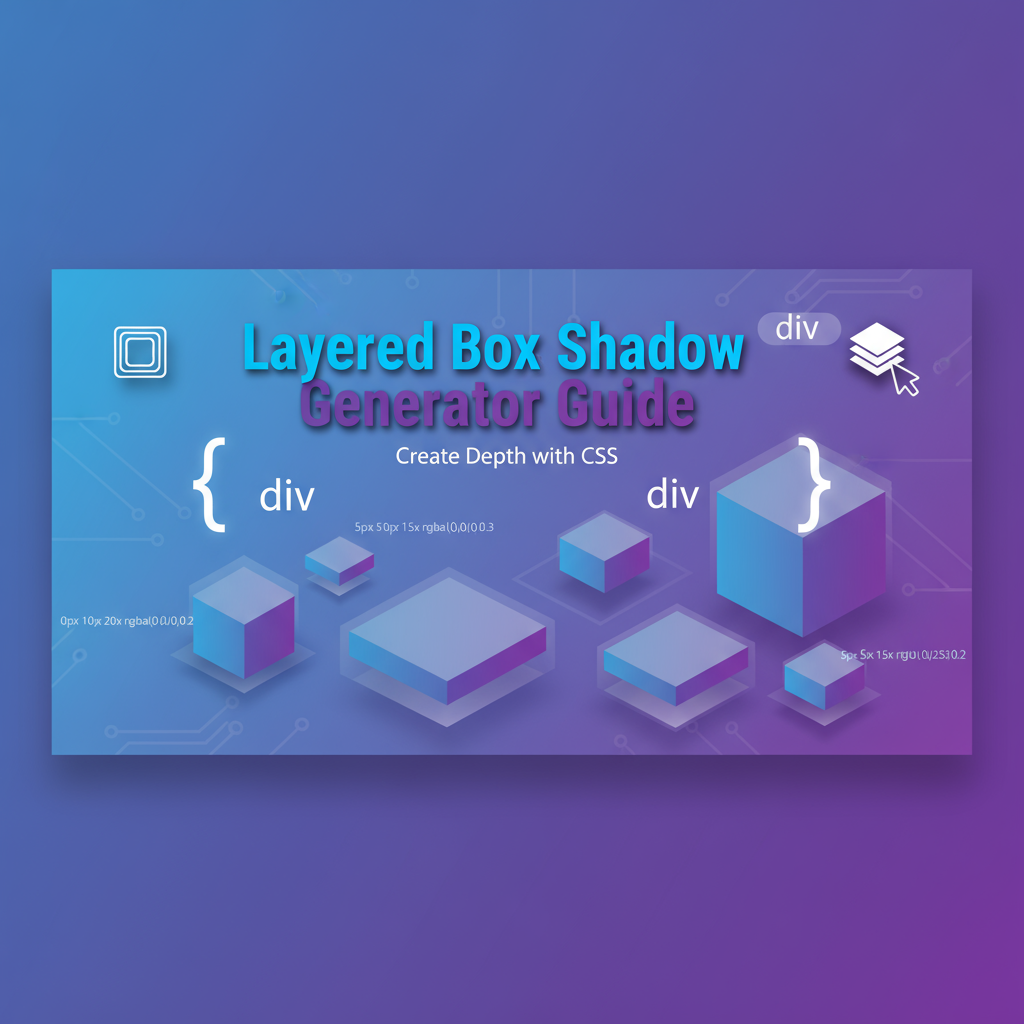
Introduction: The Art and Science of Shadow Design
Shadows are fundamental to human visual perception—our brains use them to understand depth, distance, and spatial relationships in the physical world. In digital interface design, CSS box-shadow replicates this natural phenomenon, transforming flat screens into spaces with dimension and hierarchy.
The modern web has evolved beyond skeuomorphism’s literal shadows to embrace sophisticated shadow systems that communicate interaction affordances, visual priority, and brand personality. From Google’s Material Design elevation framework to the recent neumorphism trend, shadows have become a primary tool for creating usable, beautiful interfaces.
This comprehensive guide explores the theory, techniques, and practical applications of CSS box-shadow, with special focus on multi-layer compositions that create realistic depth. Whether you’re implementing a design system, exploring new UI trends, or optimizing performance, understanding shadow fundamentals transforms how you approach visual hierarchy.
Background: Shadow Physics and Perception
How Shadows Work in Nature
Physical shadows result from light occlusion. Key properties that CSS box-shadow models:
- Light Source Position: Determines shadow direction (offset-x and offset-y)
- Light Source Distance: Affects shadow softness (blur-radius)
- Object Distance from Surface: Controls shadow size and sharpness (spread-radius)
- Ambient vs. Directional Light: Multiple light sources create complex shadow interactions
The CSS Box-Shadow Anatomy
box-shadow: [inset] offset-x offset-y blur-radius spread-radius color;Offset-X & Offset-Y: Position relative to element
- Positive X: Shadow to the right
- Negative X: Shadow to the left
- Positive Y: Shadow below
- Negative Y: Shadow above
Blur-Radius: Shadow softness
- 0px: Hard, sharp edge
- Higher values: Gradual fade from opaque to transparent
- Simulates light source distance (distant lights create softer shadows)
Spread-Radius: Shadow size adjustment before blur
- Positive: Expands shadow area
- Negative: Contracts shadow area
- Critical for controlling how “bloated” shadows appear
Color & Opacity: Shadow darkness and transparency
- Black (common):
rgba(0, 0, 0, 0.1)torgba(0, 0, 0, 0.5) - Colored shadows: Match brand colors at low opacity
- White shadows: For dark mode or neumorphic highlights
Why Multiple Layers Matter
Single-layer shadows often appear artificial. Real-world lighting involves:
Ambient Light: Soft, diffused light filling shadows everywhere
- CSS equivalent: Low offset, high blur, low opacity
- Example:
0 0 20px rgba(0, 0, 0, 0.05)
Directional Light: Primary light source creating defined shadows
- CSS equivalent: Medium offset, medium blur, medium opacity
- Example:
0 4px 12px rgba(0, 0, 0, 0.15)
Contact Shadow: Dark area where object meets surface
- CSS equivalent: Minimal offset, low blur, concentrated darkness
- Example:
0 1px 2px rgba(0, 0, 0, 0.2)
Combining these creates perceptually accurate depth.
Practical Workflows for Shadow Design
Workflow 1: Establishing a Shadow System
Challenge: Create consistent depth across an entire application
Step 1: Define Elevation Levels Map UI hierarchy to shadow intensity:
- Level 0: Flush with background (no shadow)
- Level 1: Slightly raised (cards, panels)
- Level 2: Floating (dropdowns, tooltips)
- Level 3: Dialogs and modals
- Level 4: Popovers and alerts
- Level 5: Maximum emphasis (critical notifications)
Step 2: Create Base Shadows Using the Layered Box-Shadow Generator:
:root {
  /* Level 1: Resting state for cards */
  --shadow-1: 0 1px 3px rgba(0,0,0,0.12),
              0 1px 2px rgba(0,0,0,0.24);

  /* Level 2: Dropdown menus */
  --shadow-2: 0 3px 6px rgba(0,0,0,0.15),
              0 2px 4px rgba(0,0,0,0.12);

  /* Level 3: Modals */
  --shadow-3: 0 10px 20px rgba(0,0,0,0.15),
              0 3px 6px rgba(0,0,0,0.10);
}
Step 3: Apply Systematically
- Document use cases for each level
- Create utility classes (
.shadow-1,.shadow-2, etc.) - Train team on appropriate level selection
Step 4: Implement Hover States Increase elevation on interaction:
.card {
  box-shadow: var(--shadow-1);
  transition: box-shadow 0.3s ease;
}

.card:hover {
  box-shadow: var(--shadow-2);
}
Workflow 2: Designing Neumorphic Interfaces
Challenge: Create soft, extruded UI elements that appear to emerge from the background
Core Principle: Neumorphism uses dual shadows (light and dark) to simulate a light source hitting a raised surface.
Step 1: Choose Base Color
- Light neutrals work best: #e0e0e0, #f0f0f0
- Must be solid color (gradients break the effect)
Step 2: Position Light Source Typical: Top-left corner
Light shadow (top-left):
box-shadow: -8px -8px 15px rgba(255, 255, 255, 0.7);Dark shadow (bottom-right):
box-shadow: 8px 8px 15px rgba(163, 163, 163, 0.2);Combined:
.neumorphic {
  background: #e0e0e0;
  box-shadow: -8px -8px 15px rgba(255, 255, 255, 0.7),
              8px 8px 15px rgba(163, 163, 163, 0.2);
}
Step 3: Create Pressed State Invert shadows for pushed-button effect:
.neumorphic:active {
  box-shadow: inset -4px -4px 8px rgba(255, 255, 255, 0.5),
              inset 4px 4px 8px rgba(163, 163, 163, 0.2);
}
Pro Tips:
- Keep spreads at 0 or slightly negative to prevent bloat
- Match blur radius to offset distance for natural appearance
- Test accessibility—neumorphism can have low contrast issues
Workflow 3: Performance Optimization for Complex Shadows
Challenge: Multi-layer shadows on many elements cause rendering lag
Diagnosis: Use browser DevTools Performance tab to identify shadow-related paint operations
Strategy 1: Reduce Layer Count
- Audit existing shadows: Can 3 layers be simplified to 2?
- Combine similar shadows into single layer with adjusted parameters
Strategy 2: Use GPU Acceleration Force shadow rendering to GPU:
.shadow-heavy {
  will-change: box-shadow; /* Use sparingly, only during interaction */
  transform: translateZ(0); /* Force layer creation */
}
Strategy 3: Limit Shadow Scope
- Apply shadows only to visible elements (use Intersection Observer)
- Remove shadows on mobile if performance is critical
- Use simpler shadows for list items (consider border instead)
Strategy 4: Animate Transform, Not Shadow Instead of:
.card:hover {
  box-shadow: 0 20px 40px rgba(0,0,0,0.3);
}
Try:
.card {
  box-shadow: 0 20px 40px rgba(0,0,0,0.3);
  transform: translateY(0) scale(1);
  transition: transform 0.3s ease;
}

.card:hover {
  transform: translateY(-4px) scale(1.02);
}
Shadow stays constant, movement creates illusion of elevation change.
Comparative Analysis: Shadow Techniques
Box-Shadow vs. Drop-Shadow Filter
| Aspect | box-shadow | filter: drop-shadow() |
|---|---|---|
| Clipping | Respects border-radius | Follows element shape (including transparency) |
| Performance | Better for simple shapes | Better for complex SVG/PNG with alpha |
| Multi-layer | Unlimited layers | One shadow per filter call |
| Inset shadows | Supported | Not supported |
| Browser support | Excellent (IE9+) | Good (IE unsupported) |
Use box-shadow when:
- Working with standard box elements
- Need inset shadows
- Require multiple shadow layers
- Supporting older browsers
Use drop-shadow when:
- Shadowing PNG images with transparency
- Shadowing SVG shapes
- Want shadows to follow non-rectangular shapes
Material Design vs. Neumorphism
Material Design Shadows:
- Philosophy: Simulate paper layers in 3D space
- Structure: Two shadows (ambient + directional)
- Characteristics: Vertical offset (Y-axis), subtle horizontal spread
- Best for: Information hierarchy, card-based layouts
- Accessibility: High contrast, clear affordances
Neumorphic Shadows:
- Philosophy: Simulate soft, embossed surfaces
- Structure: Two shadows (light + dark, opposite corners)
- Characteristics: Equal X and Y offsets, same blur on both shadows
- Best for: Minimalist interfaces, decorative elements
- Accessibility: Challenges with low contrast, use sparingly
Single-Layer vs. Multi-Layer Shadows
Single Layer:
- ✅ Best performance
- ✅ Simplest to maintain
- ✅ Sufficient for subtle depth
- ❌ Can appear flat or artificial
- ❌ Limited realism
Multi-Layer (2-3 layers):
- ✅ Realistic depth perception
- ✅ Matches natural lighting
- ✅ Professional appearance
- ❌ Performance cost on many elements
- ❌ More complex CSS
Recommendation: Use 2-layer shadows as default for primary UI components (cards, buttons, modals). Reserve single-layer for list items and minor elements. Avoid 4+ layers except for artistic hero sections.
Best Practices & Design Principles
Accessibility Considerations
-
Don’t Rely on Shadows Alone
- Shadows enhance but shouldn’t be the only interactive indicator
- Combine with color changes, borders, or icons
- Test in high-contrast mode (shadows may be ignored)
-
Maintain Sufficient Contrast
- Neumorphic designs often fail WCAG standards
- Ensure text and interactive elements have 4.5:1 contrast minimum
- Use the Universal Color Converter to verify
-
Respect Motion Preferences
- Animated shadows can trigger vestibular issues
- Honor
prefers-reduced-motion:
@media (prefers-reduced-motion: reduce) {
  * {
    transition-duration: 0.01ms !important;
  }
}
Performance Guidelines
-
Optimize Shadow Complexity
- Mobile: 1-2 layers maximum
- Desktop: 2-3 layers acceptable
- Avoid shadows on elements with frequent repaints (scrolling lists)
-
Use CSS Variables for Consistency
:root { --shadow-sm: 0 1px 3px rgba(0,0,0,0.12); --shadow-md: 0 4px 6px rgba(0,0,0,0.15); --shadow-lg: 0 10px 20px rgba(0,0,0,0.15); } -
Profile with DevTools
- Check Paint times in Performance tab
- Look for excessive Composite Layers
- Consider removing shadows if frame rate drops
Design System Integration
-
Document Shadow Scales
- Define semantic levels (e.g., “card-resting”, “card-hover”, “modal”)
- Provide visual examples for each level
- Explain appropriate use cases
-
Create Reusable Utilities
.elevation-1 { box-shadow: var(--shadow-1); } .elevation-2 { box-shadow: var(--shadow-2); } .elevation-3 { box-shadow: var(--shadow-3); } -
Support Dark Mode
@media (prefers-color-scheme: dark) {
  :root {
    --shadow-1: 0 1px 3px rgba(0,0,0,0.5),
                0 0 10px rgba(255,255,255,0.05);
  }
}
Common Pitfalls to Avoid
Pitfall 1: Over-Shadowing
- Problem: Too many layers or excessive blur creates muddy, unprofessional appearance
- Solution: Start subtle and increase incrementally; less is more
Pitfall 2: Ignoring Light Source Consistency
- Problem: Shadows in different directions across the same interface
- Solution: Establish one primary light source direction (typically top-left) and apply consistently
Pitfall 3: Forgetting Dark Mode
- Problem: Shadows invisible or overwhelming on dark backgrounds
- Solution: Adjust opacity and potentially add light-colored highlights in dark mode
Pitfall 4: Animating All Properties
- Problem:
transition: allincludes box-shadow, causing performance issues - Solution: Explicitly list transitioned properties or exclude box-shadow
Case Study: E-Commerce Product Card Redesign
Client: Mid-size online retailer Challenge: Product cards appeared flat and unengaging, leading to low click-through rates
Initial State:
.product-card {
  background: white;
  border: 1px solid #ddd;
  border-radius: 8px;
  padding: 16px;
}
Problems Identified:
- No visual hierarchy
- Cards blended into page background
- No interactive feedback on hover
Solution Using Layered Shadows:
Step 1: Establish resting state elevation
.product-card {
  background: white;
  border-radius: 8px;
  padding: 16px;
  box-shadow: 0 2px 8px rgba(0, 0, 0, 0.08),
              0 1px 3px rgba(0, 0, 0, 0.05);
  transition: all 0.3s cubic-bezier(0.4, 0, 0.2, 1);
}
Step 2: Implement hover state with increased elevation
.product-card:hover {
  box-shadow: 0 8px 24px rgba(0, 0, 0, 0.12),
              0 3px 8px rgba(0, 0, 0, 0.08);
  transform: translateY(-4px);
}
Step 3: Add focus state for accessibility
.product-card:focus-within {
  box-shadow: 0 8px 24px rgba(0, 100, 200, 0.15),
              0 3px 8px rgba(0, 100, 200, 0.1);
  outline: 2px solid #0064c8;
  outline-offset: 2px;
}Results:
- 23% increase in product card click-through rate
- Reduced bounce rate by 15%: Users explored more products
- Positive user feedback: Cards felt “more premium” and “interactive”
- No performance impact: Profiling showed negligible paint time increase
Key Takeaway: Subtle, well-executed shadows significantly improve perceived quality and interactivity without requiring major design overhauls.
Call to Action & Advanced Resources
Start Designing with Depth Today
Master layered shadows using the Layered Box-Shadow Generator:
- Experiment with the preset gallery for instant professional styles
- Create custom shadow systems tailored to your brand
- Export clean CSS for immediate implementation
Expand Your CSS Toolkit
Complementary Tools:
- CSS Generator Suite: Complete CSS effect library including gradients, transforms, and more
- Text Shadow Generator: Specialized typography shadow effects
- Gradienta Pro AI CSS Editor: AI-powered gradients to pair with shadow effects
- Universal Color Converter & Palette Tool: Verify shadow color accessibility
Further Reading
Official Documentation:
Design Principles:
Performance Optimization:
Transform your interfaces with professional depth—start exploring layered shadows today and elevate your UI design to new levels of sophistication.